Let “SMEG” make Singapore cool always!
My design is a reference of a Pinball machine showcasing some Singapore’s iconic structures that has garnered several international accolades!
For the start, a pinball zoom forward - depicting a robust building and infrastructure sector, contributing significantly to its economy and development. Key areas include transportation networks (Expressway signages), public housing (the chairs and round table as a community harmony), and sustainable urban development (Gardens by the Bay, the Jewel, the Esplanade).
The crescent moon signifies a young nation on the rise. The five stars represent the ideals of democracy, peace, progress, justice and equality.
Changi airport connects us and enhances Singapore’s global connectivity and becoming an aviation hub.
Within 60 years, Singapore has achieve and prospered against the odds.
Happy Birthday, Singapore!
Gift For Singapore
Singapore is like a living artwork , so I wanted to incorporate the Art Science Museum into the design.Singapore is also has an abundance of flowers presented across the island.The success of the Art Science Museum also mirrors the creativity and efficiency of our people. As Singapore marks its 60th birthday I want to celebrate this beautiful country through this illustration and look forward to Singapore's future.
Fruity Otter
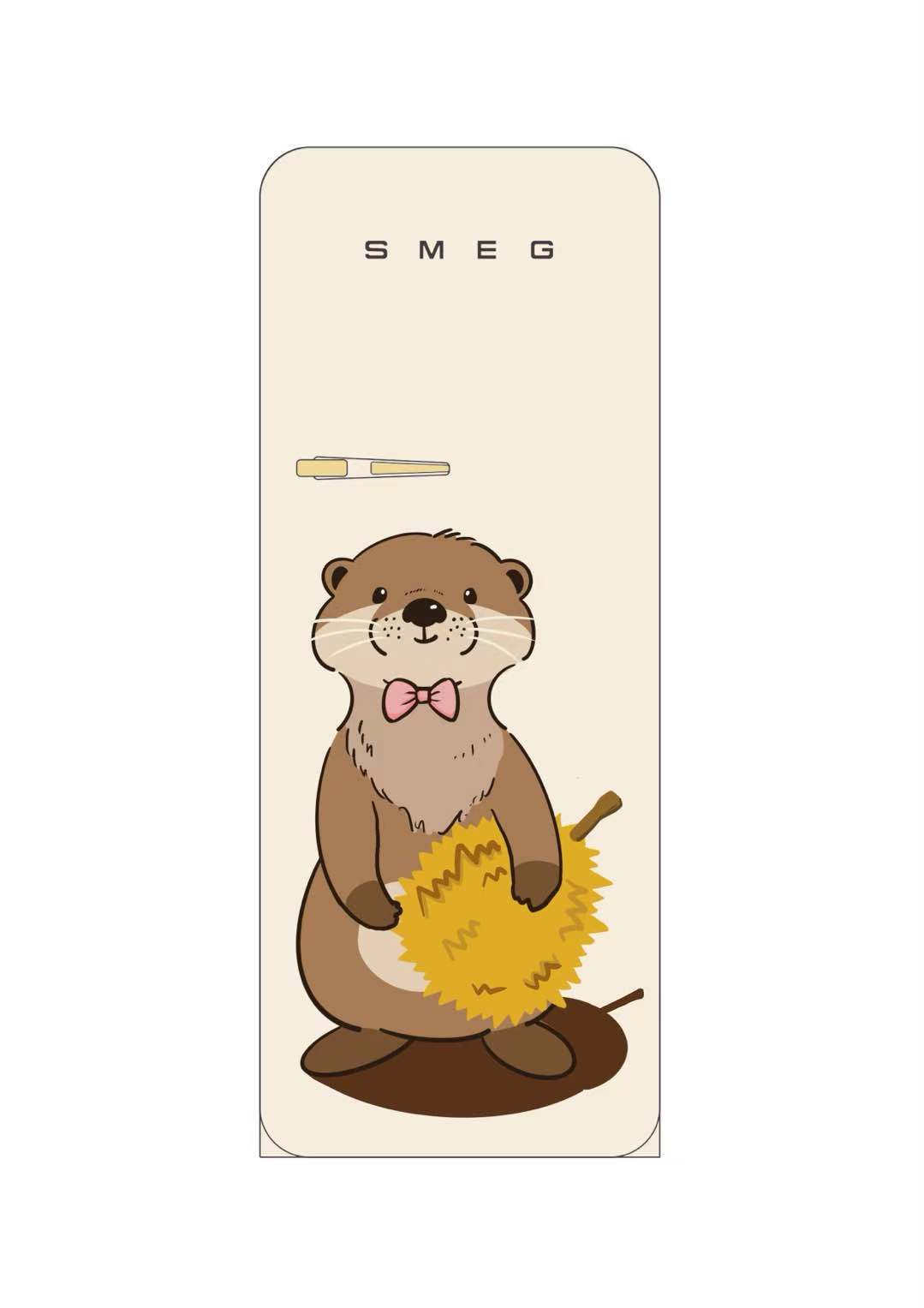
The design concept of this refrigerator revolves around Singapore, combining the unique cultural elements of Singapore with cute images.
The otter is one of the native animals of Singapore, and it is more common in the natural environment of Singapore. Designing the otter as the main body can evoke the warm feelings and identity of Singapore people towards the native natural ecology.
Durian is a well-known specialty fruit in Singapore and occupies an important position in Singapore's food culture, which is loved by many people. Incorporating durian into the design further strengthens Singapore's regional characteristics.
The overall design style is cute and playful, in line with the current aesthetic trend, and can attract consumers of different ages. Through this design that combines local animals with distinctive fruits, it not only showcases Singapore's unique natural and culinary culture, but also conveys a relaxed and joyful attitude towards life, allowing users to feel the unique charm and cultural atmosphere of Singapore in their daily lives.
SG60 APPS
SG 60 REFLECTS ON HOW COMMUNICATION IS IMPORTANT TO STAY RELEVANT AND HOW THE PEOPLE PERSEVERE THROUGHOUT THE 60 YEARS OF INDEPENDENCE. WITH THE BEAUTY OF OUR DIFFERENT CULTURES AND RESPECT TOWARDS EACH OTHER, WE MADE FRIENDS AND BUILD COMMUNITIES. TOGATHER WE BUILD SINGAPORE!
Celestial Singapore Fusion
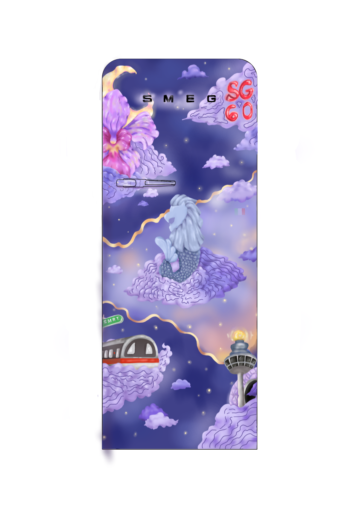
My design demonstrates Singapore's vision to build itself quietly through the night, only to shine even brighter at dawn. Inspired by the quote ‘Never dull your shine for somebody else’ and my own words', it carries resilience, growth and unity. For instance, I have included the national orchid flower as a symbol of Singapore’s position as a City in Nature, alongside iconic landmarks like the Merlion, MRT, Changi Airport, and Jewel. Placing them on soft clouds adds an outer-space celestial feel.
Each of them represents the journeys that Singaporeans have made through the years.
The night and dawn theme is deeply personal to me. The contrast adds context to how I designed the concept. Be it a good or bad day, I often found solace in looking at the moon or watching the sunset. The scenery and joy inspired me to piece together a wonderful design.
Overall, the design concept helps to remind us that, above the rush of daily life, there’s always space. To dream, to grow, and to glow.
Nasi Lemak for Breakfast
Food brings people together and one could reflect past memories of having meals together with family. I choose nasi lemak as the design as my mornings always starts with it freshly bought from the hawker center by my parents!
Pink I See
The name of my design is inspired by combining the Pink IC (Identity Card of local Singaporeans) and my perspective as a proud resident, almost as if through rose-coloured (pink) lenses. I wanted to take on a more unique approach to illustrate the local flora and fauna of Singapore rather than the more common touristy aspects. The plants I decided to include consist of the iconic Vanda Miss Joaquim orchid and the bougainvillaea, which can be found everywhere in Singapore. As for the animals, I decided on the myna and pigeon, which all Singaporeans know, whether they love them or not!
Steady Pom Pi Pi
This design blends classic Peranakan 'tiles' with iconic symbols like the Merlion, Botanic Gardens, and Changi Airport. It celebrates Singapore's steady spirit and vibrant culture - bold, proud, and uniquely home.
Little Red Dot
As we mark 60 years of independence, this artwork portrays Singapura as a country brewed with Joy and relentless heart.
The jubilant little red dot symbolises every Singaporean, full of spirit and love for our country. Little Red waves the Singapore flag with pride, representing the strength and unity of our people.
Beloved hawker favourites like Kopi, Teh Tarik, Hainanese Chicken rice and Roti Prata, representing Singapore as a melting pot of culture.
Our National Flower, the Vanda Miss Joaquim blooming along the feet of Little Red, reminds us of our resilience and how far we’ve blossomed as a nation.
The appearance of our Iconic landmarks and public transports such as the MRT, Marina Bay, Changi Airport and The Singapore Flyer showcases the advancements we’ve made through connectivity within the country and the world.
United By Food
Regardless of races and languages, food can always be shared among everyone, have a meal together and build a community. Since it's SG60, I thought to use Singapore flag as a theme and colour palette. It's the unity and compromises among us that help build the nation.
LUNCH TIME
This concept celebrates Singapore’s deep passion for food, where dining out is more than a habit, it’s a connection to our roots and upbringing. Hawker culture represents the flavours of home and the bonds we share. This SG60, we honor the dishes that define our identity and the vibrant “melting pot” that makes Singapore uniquely delicious.
SUPERMARKET VOUCHERS
THANK YOU AND WISHING A HAPPY 60TH BIRTHDAY SINGAPORE!
Merlion In Sea
The Merlion is Singapore's official mascot. It looks like a mythical animal with a lion's head and a fish's body. It is very important to Singapore and its people. You can see it in many places, like on sports teams, ads, and tourist things.
The Merlion first was the logo for Singapore's tourism board. Its name comes from "mer" (which means sea) and "lion". The fish body shows Singapore started as a fishing village called Temasek, meaning "sea town" in Javanese. The lion head is because Singapore's old name was Singapura, which means "lion city".
A man named Alec Fraser-Brunner designed it. It was the tourism board's logo from 1964 to 1997 and has been a trademark since 1966. Even though the tourism board changed its logo in 1997, the Merlion is still protected. You need permission to use it, and it often appears on tourist souvenirs approved by the board.
Game On, Lah!

This design, "Game On, Lah!" is a love letter to the childhoods we’ve all shared — no matter who we are or where we come from in Singapore.
From the jingle of five stones landing on tiled floors, to the sharp smack of flag erasers in a heated recess match, to the barefoot races across void decks with a football — these are the sounds and stories of growing up in our little red dot. Games like chapteh, hopscotch, and zero-point didn’t just fill our afternoons; they built bridges. They brought together children of every race, language, and background — united by laughter, competition, and the pure joy of play.
Through this hopscotch-inspired design, I wanted to capture that timeless, playful spirit — a journey through six decades of play that defined us, connected us, and made us feel like we belonged.
As Singapore celebrates her 60th birthday, may we remember that beneath our differences, we all share the same childhood echoes — of fun, friendship, and a nation that plays together, grows together.
Whispers in Bloom
My illustration depicts a diverse array of wildflowers that can be found in the streets of Singapore. These flowers are frequently overlooked due to their size, yet they evoke a profound sense of wonder and awe in the eyes of a child.
Amidst the unsung heroes who have dedicated their lives over the years, making SG60 a significant milestone in our nation’s history, these wildflowers have adorned the Singapore landscape, adding vibrant hues to our cityscape in their understated manner.
Sunny Island
Over 60 years of independence, Singapore has developed from a tropical village to a metropolitan city recognised around the world. However, there is a timeless beauty in the icons of flora and fauna. This design seeks to make use of the retro 1970s aesthetic that would suit the regular SMEG design, depicting the lion as a symbol of strength, power and progress, whilst the Vanda Miss Joaquim orchid stands with the beauty that it represents as Singapore's national flower. This design seeks to hold a bold presence as well as serve as an aesthetically pleasing painting of patriotism. The stars on the red banner are reminiscent of the crescent moon and stars that are so ubiquitous in Singapore's vernacular.
Blooming Maritime Island Nation

Singapore's culture is embracing and diverse, there are so many things to talk about, but to make the design more inclusive, I have included elements related to nature in Singapore in the design. I chose some of Singapore's representative natural species such as lion, Crimson Sunbirds, the flowersVanda Miss Joaquim, Tembusu tree
, rain tree, and some shapes that you may not be able to tell but are Singapore's speciality pastries as embellishments. In terms of colours, I chose red, yellow and blue. Of course red is the symbol colour of Singapore. The warm yellow represents the colour of the sun, under which Singapore thrives. The blue colour, apart from contrasting with the warmer red colour, like the moon in the flag compared to the warm red colour, also reflects the fact that Singapore as an island nation is closely related to the sea. Considering the refrigerator is a piece of long-term furniture, I reduced the saturation of the colour scheme to avoid visual fatigue for the user. Last but not least, I wish Singapore all the best as it celebrates its 60th anniversary.
Tiles & Tones: A Medley of Singapore
“Tiles & Tones: A Medley of Singapore” is inspired by the iconic Peranakan tiles adorning the traditional Joo Chiat shophouses. Featuring 60 tiles in celebration of SG60, the design weaves together icons from Singapore's past and present against vivid palette - illuminating the island's rich cultural diversity and heritage. From architecture and cuisine to customs and traditions, it charts the remarkable journey Singapore has undertaken in building its identity. It also pays tribute to our Garden City, showcasing native flora and fauna that define Singapore's landscape.
FREE SG CALENDAR
THIS DESIGN REPRESENT A CALENDAR, A THROWBACK DURING THE DAYS GETTING FREE CALENDAR WITH PURCHASE OF CYLINDER GAS. A REMINDER EVERY YEAR ON AUGUST 9TH, AND IN 2025 A HAPPY 60TH BIRTHDAY SINGAPORE.
Family in The Garden City
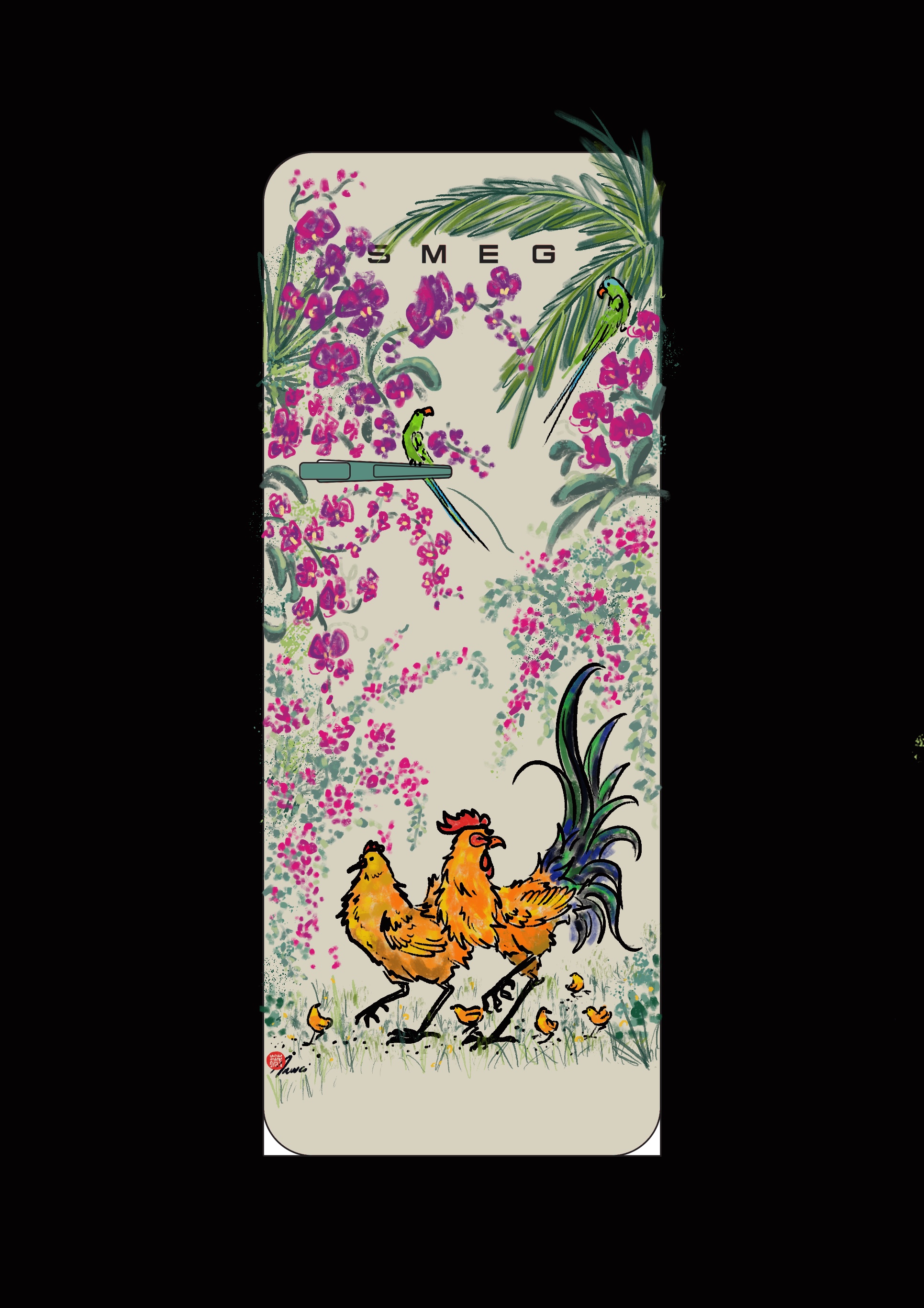
Growing up in Singapore I have come to notice the small iconic wildlife and flora around me, which thus lead me to this inspiration of a family of roosters with two parakeets surrounded by Singapore’s iconic floras which represent living beautifully, peacefully, and thriving in a lush green and tropical paradise.
The kitchen is an important room for family and community, especially the role of the refrigerator being the main piece in the room. Therefore I chose my subjects carefully, A family of Roosters frolic freely through a bush of Bougainvillea. Representing a happy family life, surrounded by Bougainvilleas which’s were brought to Singapore in 1925 and now has been an everlasting icon to Singapore’s landscape.
Orchids are the national flower of Singapore, they intertwine and surround the refrigerator with movement and life with new flower buds to bloom, representing the blossoming and thriving garden city of Singapore. Two playful parakeets chatting with each-other amongst the orchids represent the joyful and diverse community of Singapore. Sheltered by palm trees, which represent Singapore’s protection and being in a tropical haven.
SMEG x SG : Built to Endure

“SMEG x SG : Built to Endure” pays tribute to the resilience of both Smeg’s storied heritage brand and Singapore’s remarkable transformation over the past 60 years. Rooted in Smeg’s own beginnings in Guastalla, Reggio Emilia, this design echoes the brand’s evolution -- from metalworking origins to a global design icon. In parallel, the illustration captures Singapore’s journey from humble kampungs to a thriving metropolis. The transition from rustic shophouses to high-rise buildings reflects our nation built through resilience and foresight. Central to the design is the military vehicle, referencing Singapore’s defence evolution -- from early 3-tonners to today’s modern forces -- symbolising strength, sovereignty, and the sacrifices made to secure them. The iconic signage of ‘Singapore’ bearing 4 languages, a familiar sight at every construction site, serves as a nod to unity in diversity and the continuous building of our shared future. This fridge is not merely decorative -- it is a reminder of progress, pride and the timeless efforts of Smeg’s legacy of craftsmanship and Singapore’s journey of transformation -- both built to endure.
Back In My Day
A mosaic of Singapore's colourful history and everyday sights. This design is inspired by packaging and colours that I find nostalgic: Yu Yee oil, Tiger Balm ointment, vintage biscuit tins, Peranakan shophouses, and tingkat containers. I wanted to weave in intricate, floral details and sprinkle in some easter eggs of Singapore sights within the artwork.
Diving into SMEG's history and collaborations, I was entranced by the fridge designs with Dolce & Gabbana. I decided to let that inspire my colour palette, and allow myself to break free from using only red & white as a tribute to Singapore.
60 Iconic Years
To commemorate Singapore’s 60th National Day, this limited-edition SMEG fridge design celebrates the rich cultural mosaic that makes Singapore uniquely Singapore.
Featuring 60 iconic cultural elements — from architectural landmarks and beloved local dishes to nostalgic objects, currency, and everyday symbols of national pride — this design is an artistic tribute to the nation’s extraordinary evolution over the past six decades.
Each icon tells a story. Together, they form a visual tapestry of who we are, where we’ve come from, and what we hold dear. It’s a celebration not just of progress, but of identity — the small things that shaped a big nation.
Just like Singapore, the fridge is a fusion of function and flair, heritage and modernity. This is not just an appliance — it’s a canvas of collective memory, a keepsake of national spirit, and a love letter to 60 years of culture, community, and change.
Preserving Peranakan
This design takes inspiration from Singapore's Peranakan style. The color palette which is pink, green, and cream gives a sense of vintage elegance and also modern minimalistic. By embedding Peranakan aesthetic into a modern object which is a fridge, connects the past and the present, making this tradition became a part of everyday life. This design also serves as a reminder to the younger generation about Singapore's deep culture, that Singapore had Peranakan before and still does until now.
Food Ferris Fusion
Cannot decide what to eat today? Take a ride on the Food Ferris, look into your fridge for your favorite ingredients and whip up Laksa, Satay, Chicken Rice or indulge in Singapore's favorite Chilli crab!
Coming Together in Red and White

This design highlights the distinct contrast of red & white, echoing the Singapore flag and its strong national identity. The top white section showcases traditional delicacies and snacks loved by Singaporeans—flavourful, affordable foods from different cultures that we proudly share with visitors and enjoy from morning to night. The king and queen of fruits are presented in a playful keychain format, alongside our national orchid as a nod to our vibrant heritage, multicultural roots, and love for nature.
The small subtle square-like dot symbolises a trail, representing how our shared love for food and culture connects every generation. It reflects the resilience and openness that have guided our journey and helped us come together despite the odds.
The vibrant red base celebrates Singapore’s unique landscapes—famous sights where countless travellers pause to take photos and admire the blend of modern architecture and lush greenery. These landmarks reflect our vision of a green city and our bold spirit to create spaces that promote healthy living. The red and white outlines are a tribute to our national colours, boldly framing the Singapore story with unity, progress & pride.
Block by Block

Block by Block is inspired by the iconic void deck table once common across Singapore’s HDB estates — easily recognised by its blue-and-white mosaic tiles and central chessboard. These tables were everyday gathering spots, where neighbours played Chinese chess, chatted, or simply passed time. Today, they’ve become increasingly rare, slowly disappearing from newer estates.
This design brings that familiar look into the home, turning a fading piece of local culture into something bold and meaningful. Its bright colours pair naturally with SMEG’s retro and playful aesthetic, while paying tribute to Singapore’s 60 years of nation-building — with HDB blocks and void decks forming the backdrop of many Singaporean lives.
The central chessboard motif also opens up the possibility for a fun, interactive twist: magnetic chess pieces shaped like nostalgic icons or local snacks (such as ice gem biscuits, kueh, and kopi cups) can transform the fridge into a unique space for entertainment — blending utility, culture, and a touch of childhood joy, block by block.
The Lion City Mosaic - SMEG x SG 60

Peranakan history is deeply intertwined with Singapore's history, particularly its colonial and cultural development. With exquisite, original Peranakan tile designs, each tile tells a unique story: from Mr Lee Kuan Yew’s historic declaration of independence, to the start of National Service, the founding of Singapore Airlines, and the rise of everyday life in iconic HDB flats. Intricate illustrations capture the early SBS bus, the launch of the MRT system, Changi Airport and Jewel, and the architectural marvels of Marina Bay Sands and the Esplanade. Celebrate lush landmarks like Gardens by the Bay and the Botanic Gardens, with beloved icons such as the Merlion, playful otters, and majestic hornbills. Scattered among the tiles are mouth-watering tributes to local favourites – Nonya kueh, chilli crab, satay, and kaya toast – along with proud moments like the Lion’s Malaysia Cup win, our Olympic swimming gold and a tribute to medical staff during the covid-19 pandemic. Embedded in the tile designs are motifs such as the nostalgic Dragon playground and our very own Vanda ‘Miss Joaquim”. This design is a vibrant canvas of Singapore’s 60 years of heritage, heart and hope.
60 Years of Flow
60 Years of Flow pays tribute to Singapore’s evolution as an island nation shaped by water, movement, and transformation. Inspired by the quiet elegance of moon jellyfish, the artwork captures a sense of fluid continuity—where past, present, and future drift together in luminous suspension.
The glowing forms of the jellyfish evoke both fragility and resilience, mirroring Singapore’s own journey over the past six decades. Their rhythmic flow through deep blue currents symbolizes how the country has navigated change: gracefully, steadily, and with an inner pulse of strength.
Rendered in watercolor, this work explores the interplay of translucency, light, and impermanence. It is an invitation to reflect on the delicate balance between growth and preservation. By bringing this imagery onto a fridge, a fixture of everyday life, 60 Years of Flow offers a meditative pause, a reminder that even in stillness, we are always in motion
Singapore: Our Familiar HDB
The simple yet bold design is inspired by the HDB that hold a special place in the hearts of Singaporeans. To me, the HDB represents a community living together in harmony and diversity, shaping the nation we have today. The distinct red of the HDB not only represents our nation colour but also traces back to what an old HDB looks like. I've incorporated familiar elements like the communal sharing table, where families would gather to play chess, and the old-fashioned tiles that once adorned some homes. These touches evoke the warmth we felt in those shared spaces, where everyone belonged.
The geometric shapes in red and white create a retro style that effortlessly blends the past with a timeless appeal, capturing SMEG's signature red and its distinct aesthetic. The simplicity in the design also invites personalisation with Singapore-themed magnets, whether of iconic buildings or tasty foods, allowing each person to reflect their own memories and stories.
Our Playground
The playground is a space where the kids can imagine they flew with the dragons, swam with seals, letting their imagination run wild. As time past, these HDB playground becomes iconic, binding memories of a lot of Singaporean born between the seventies and eighties.
The Peranakan tiles that we often see in the old coffeeshops and shophouses. I am always amused by the tiles, with their intricate details and vibrant colours. The tiles showcases the cultural diversity of Singapore, the harmony among different races and culture.
In my design, I choose these elements as they tell a story to never forget our heritage and our unique cultural identity. Meanwhile, never afraid to imagine, to venture, like how we played in these playground and always honouring the past and embracing the future.
A Gift For Singapore
The design is inspired by this video "SG60 - A Refreshed Spirit". I used the wave pattern as Singapore is surrounded by water and water "refreshes". I drew fishes as they meant "abundance (有余)" in Chinese, I wish Singapore will be filled with blessings for her people and rest of the world. I included words which was conveyed via SG60 website to remind ourselves the nation's goals ahead. I hope that this design will remind us that it is not easy for a small island like Singapore to achieve our success, and let us not take for granted the peace and harmony we enjoyed in this nation.
Singapore’s Soul
The “Singapore’s Soul” edition of the Smeg fridge is a heartfelt tribute to what truly defines the nation its vibrant landmarks, harmonious community, and a deep sense of pride and belonging. This design doesn’t just celebrate 60 years of progress; it captures the spirit, warmth, and charm of everyday Singapore.
Singapore’s Soul
The “Singapore’s Soul” edition of the Smeg fridge is a heartfelt tribute to what truly defines the nation—its vibrant landmarks, adorable native animals, harmonious community, and a deep sense of pride and belonging. This design doesn’t just celebrate 60 years of progress; it captures the spirit, warmth, and charm of everyday Singapore.
Moon City
A bright full moon rising over Singapore’s tranquil skyline - the tranquil atmosphere felt in SMEG’s home refrigerator celebrates Singapore’s beautiful nature and provides a comfortable rest.
Rejuvenate towards future
Singapore is like a living artwork—a celebration of flora and fauna. The country is often associated with being a clean and garden-city, with an abundance of flowers presented across the island. It reflects my deep admiration for this beautiful country. The success of Jewel Changi Airport also mirrors the creativity and efficiency of our people. As Singapore marks its 60th birthday since independence, I would like to celebrate this remarkable milestone through this flat-illustration and look forward to Singapore's future.
Singlish Rocks
Singlish is our unique way of communication and a distinct identity that bonds every Singaporean. The popular Singlish words that are printed on the fridge will further elevate our local culture.
Savouring Singapore: A Celebration of Flavours
Savouring Singapore: A Celebration of Flavours is a hand-drawn artwork that brings together some of the most beloved elements of Singaporean culture through a vibrant and playful composition. At the heart of the design is the majestic Merlion along with the Singapore flag, symbolising national pride and unity. On it are iconic local delights like chilli crab, durian, bubble tea, kueh and others, representing the rich and diverse food heritage that defines Singapore. Traditional symbols like red lanterns, ketupat, oil lamps, and mandarin oranges highlight the multicultural festivals celebrated across the island. The fridge, often at the center of family gatherings and festivities, is most used during celebrations- making it the perfect canvas for this theme.
Blooming Singapore
Awed by Singapore's rapid development in the past 60 years, this design features 7 blooms of Singapore's National Flower - Vanda Miss Joaquim. The 7 flowers - one more than 6, which is derived from Singapore being 60 years old, were chosen to represent Singapore's never stagnanting development, still thriving even when faced with challenges. This simple design also reflects our simple beginnings that never deterred our progress into a thriving country.
Enjoy the fruits of Singapore transformation
Singapore has transformed from a fishing village into a strong and pure lion city in a garden. Singaporeans can enjoy the fruits of this transformation now. A happy and proud SG60.
SG Doodle
It features iconic landmarks and architecture in a unique vector illustration style. Themed around Singaporean culture - this doodle design was inspired by my visit to Singapore and captures all the elements and vibrant images that make Singapore special. I reinterpreted my favourite Singaporean icons to celebrate iconic landmarks that are a mix of culture, stories and memories. Like the slogan, the vibrant atmosphere symbolises a beautiful, joyful and fulfilling place to live, and the harmony and memories of local culture. The background design features Singapore’s national flower, the orchid, symbolising our growth as a nation. This SMEG home refrigerator celebrates Singapore’s cool and special celebratory spirit and captures memories.
United as One Nation
As a world class metropolis, Singapore is home to people from all over the world. By staying united as one nation, we will continue to strive for a better home for all.
Brewed in Bloom
SG60 is a celebration for Singapore's rich culture and heritage. I have designed this fridge to showcase the timeless charm of Nanyang Kopitiam Tiles with a modern iconic Merlion together with a traditional floral motif found in nanyang coffee cups. This design reflects the way Singaporeans honour the past while embracing the future.
Pixel Playgrounds: A Singapore Mosaic
When we were kids, these playgrounds were more than slides and climbing frames, they were magical worlds where dragons flew and watermelon slices became spaceships.
Inspired by Singapore’s beloved mosaic playgrounds, this piece reimagines those childhood memories through modern pixel art. Each pixel echoes the old mosaic tiles, blending nostalgia with a fresh, playful twist just like how Smeg fuses retro charm with contemporary design.
The ‘no signal’ screen? A little wink to the analog days of waiting for cartoons on TV, simple moments that now feel so precious.
This is my way of keeping those playground stories alive, pixel by pixel.
Celebrating a Unique Milestone
Inspired by a traditional Chinese calendar, my design aims to preserve the traditions and cultures that make Singapore unique. As we celebrate the SG60 milestone, let us continue to shine in the future and beyond.
Hidden Beauty
To celebrate SG60, I wanted to create a timeless design that people can enjoy for many years in their home.
The peranakan culture, still admired and loved until this day and one that my maternal grandmother is also a part of is the main style for this design.
In my design, nature that surrounds Singapore takes center stage in a peranakan styled design to celebrate what has come before and still exists today. The modern architecture that Singapore is so well known for has not been forgotten but takes a backseat in this design.
One Sunny Nation

Design Statement:
This design was created to celebrate the 60th anniversary of Singapore’s founding (SG60). The overall visual direction is rooted in a retro aesthetic, aiming to evoke a sense of nostalgia while also expressing appreciation for the country’s transformation over the decades.
The color palette features muted, vintage-inspired tones—such as dusty green and beige—that reference print and graphic styles from the 1960s and 70s. These colors not only reflect the era being commemorated but also bring a warm and approachable character to the piece, suitable for a collectible commemorative object.
The typography plays a central role: the words “SINGAPORE” and “GARDEN” are intentionally broken up and rearranged to form a grid-like layout. This design choice introduces a playful, slightly experimental structure reminiscent of old posters and hand-assembled print materials. It also creates a handcrafted feel that reinforces the nostalgic theme.
The typeface used was selected for its subtle retro undertones, avoiding overly modern or minimalist forms. The arrangement avoids strict symmetry or alignment, adding
My country Singapore in the future
With futuristic flying cars gliding above, Singapore could evolve into an even greener paradise—where humans and animals coexist harmoniously. Imagine playful otters by the waterways, giraffes roaming nature-integrated neighborhoods, and lush gardens thriving alongside urban life. A future where technology and nature blend seamlessly, creating a shared space for all.
Minimalistic Pride
The concept of this design is to express Singaporean pride with a modern, minimalistic look. The design features prominent Singaporean icons like the Marina Bay Sands building, the Merlion, a durian and a Vanda Miss Joaquim.
Durian di Classe
I took inspiration from something many Singaporean knows, the durian. In this design, I reimagined its iconic spiky exterior into something that is stylised into clean, geometric, classy and bold. As we mark 60 years of nation building, this piece is a subtle nod to our journey as a nation constantly evolving with boldness.
Heritage and Home
I wanted to do a doodle-based concept for the fridge design. At the edges and also surrounding our national flag in a circle, I tried to do some Peranakan-like designs to showcase Peranakan culture. Below the fridge handle is an open window with four mini dolls inside, showing the four major races of Singapore. It symbolizes Singapore being a multi-cultural and multi-ethnic society. Below the window shows some of Singapore's landmarks, the Singapore Flyer, the Merlion, and the MBS, which can be found in present day Singapore. At the bottom are some of our beloved local dishes and drink that we have for meals. The whole design hopes to celebrate present day Singapore and how far we have come since independence.
Vibrance in the Present, Echoes of the Past
This striking piece captures the spirit of Singapore at 60—where heritage and modern life come together in harmony. At its heart stands a brightly colored shophouse, a beloved symbol of the nation’s past, boldly set against a backdrop of grey. The contrast is powerful: while the present bursts with color and energy, the past remains quietly alive, shaping the city’s soul.
The surrounding grey buildings are not forgotten relics, but echoes of a time that still lingers in our memories and daily lives. They gently remind us that Singapore’s future is built upon the strength and richness of its cultural roots. The shophouse itself—decorated with blooming orchids, fluttering flags, and curious cats—radiates warmth and community, showing how tradition continues to thrive in the present.
Set against the sleek surface of a SMEG appliance, this artwork brings history into the home—infusing everyday life with meaning and memory. It’s more than a decorative piece; it’s a quiet tribute to how far we’ve come, and how deeply our beginnings continue to inspire. A true celebration of Singapore’s journey, where vibrance in the present is forever shaped by echoes of the past.
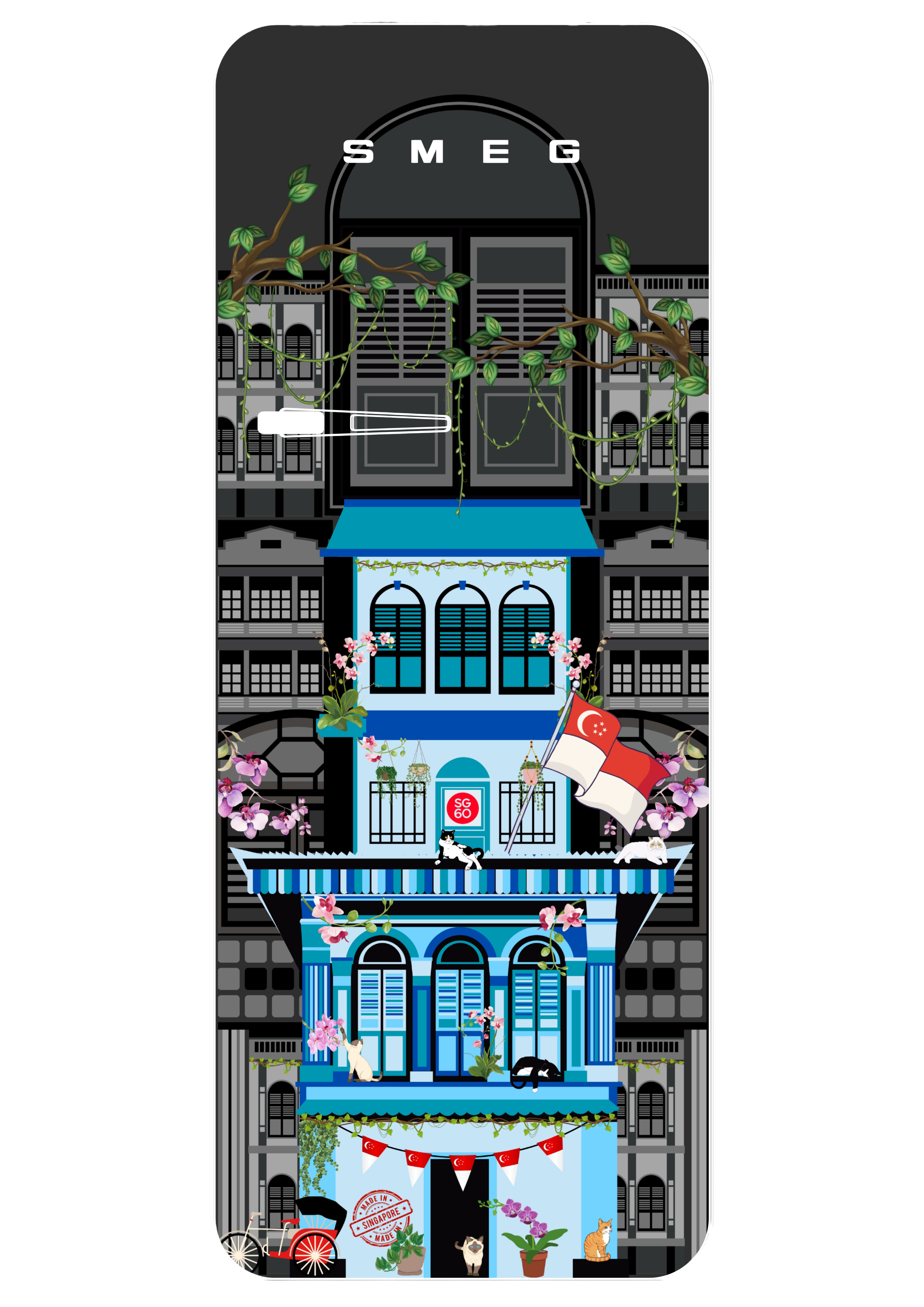
HARMONY IN HUE BY MAYNIE
In celebration of SG60, this design pays tribute to Singapore’s rich architectural heritage through the iconic shophouse. Shophouses are a defining feature of Singapore’s urban landscape, showcasing a unique blend of Chinese, Malay, and European influences. Shophouses are more than just buildings; they were once homes, businesses, and community hubs, reflecting the resilience and spirit of Singapore’s early settlers. This artwork reimagines the shophouse in a whimsical pastel palette, inspired by SMEG’s signature 1950s retro-style appliances. Known for their charming colourways and timeless silhouettes, SMEG appliances come in dreamy shades of pink, mint, blue, and cream. These colours, paired with the nostalgia of the shophouse, create a piece that blends heritage and modern design. Just like how SMEG redefines everyday appliances with personality, this piece breathes new life into tradition, reminding us that heritage can be both beautiful and cool!
Let's Go SG
It features iconic landmarks and architecture in a unique vector illustration style. Themed around Singaporean culture - this design captures all that makes Singapore special - with vibrant imagery, inspired by my 60 years celebrates trip to Singapore. I reinterpreted my favourite Singaporean icons to celebrate iconic landmarks that are a mix of culture, stories and memories. The vibrant atmosphere symbolises a beautiful, joyful and fulfilling place to live, and the harmony and memories of local culture.
Flavours of a Nation

This artwork is a vivid celebration of Singapore’s 60th birthday, portrayed through a whimsical fusion of iconic local dishes and cultural motifs. Inspired by Singapore’s identity as a food paradise, the composition bursts with dynamic color and energy, capturing the rich blend of cultures that shape the nation’s unique culinary heritage.
Hidden within the expressive forms are beloved local dishes such as satay, laksa, nonya kueh, chilli crab, and tropical fruits—each stylized and abstracted into playful, organic shapes. The national flower, the orchid, and the lion—symbol of strength and resilience—anchor the piece, representing the spirit of Singapore.
The layering of patterns and textures mirrors the country’s diverse yet harmonious society, where tradition and innovation coexist. With this painting, I invite viewers to explore a joyful, imaginative landscape of flavors and unity, and to reflect on how food connects us all in the heart of this vibrant island nation.
SMEG - Always a classic
This design is inspired by the vibrant Peranakan shophouses that are iconic to Singapore’s architectural heritage. The detailed tiles, ornate woodwork, and bold colour palette reflect a rich tapestry of cultural influences—Chinese, Malay, and European—that define our national identity. The year 1965 above the doorway marks Singapore’s birth as an independent nation, grounding the artwork in a moment of collective pride. By bringing this façade onto a SMEG refrigerator, I wanted to blend nostalgia with modern function—a celebration of history, home, and everyday beauty.
From Kampongs to Skylines
As a Gen Z, I’ve grown up seeing only the Singapore of today with its modern skylines and futuristic developments. But through stories, photos, and shared memories, many of us have glimpsed what came before. With this design, I wanted to capture that journey by showing how far we’ve come in just 60 years. From the bustling kampongs and vibrant shophouses of the past to the towering skylines we know today, this illustration is a reflection of our growth as one nation. The bold SG brush cutting across the scene symbolises this transition, connecting the past and present, reminding us that while we look to the future, our roots remain at the heart of who we are.
SG60 Steady Lah!
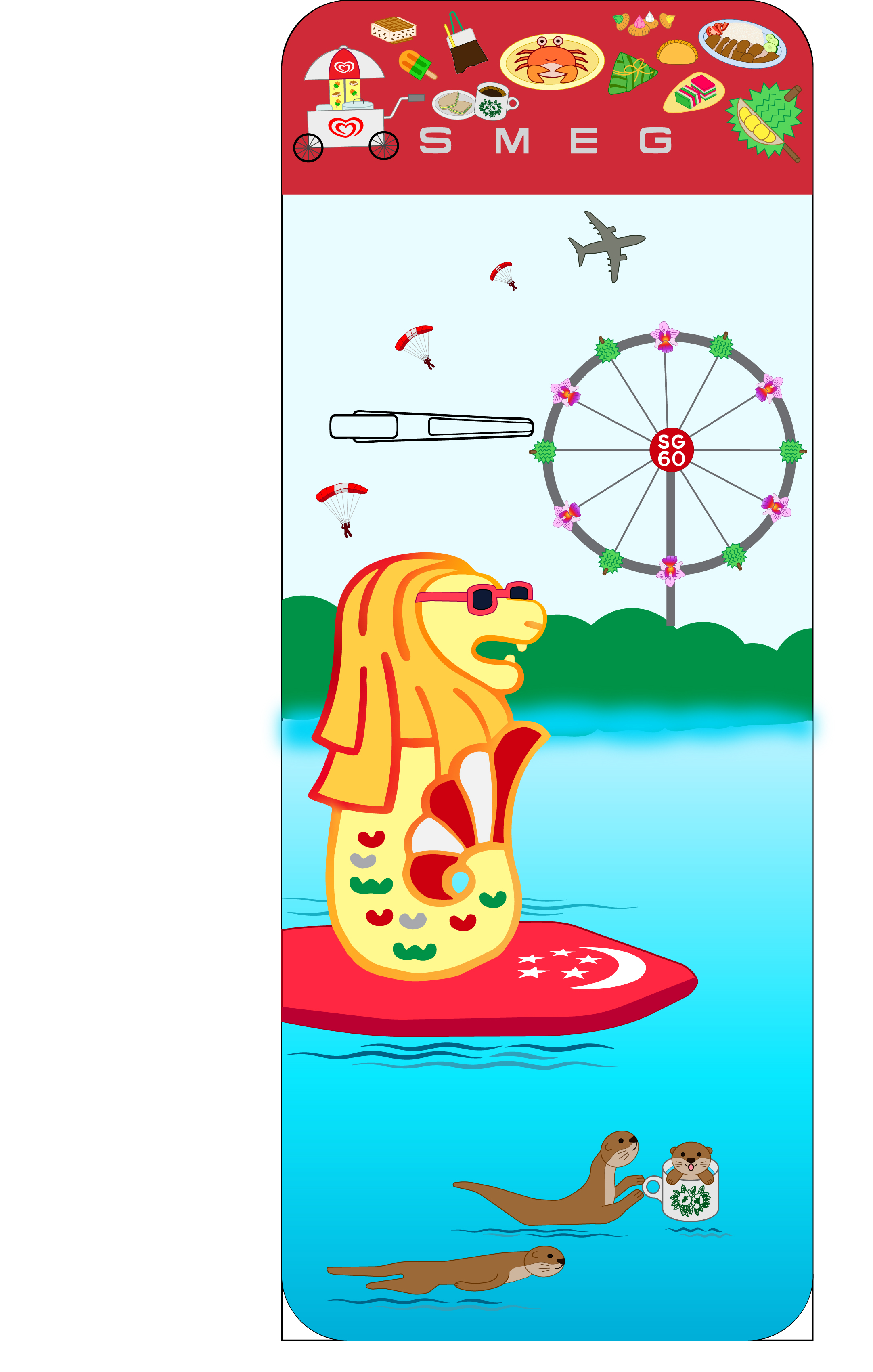
My design draws inspiration from a vibrant celebration of Singapore’s unique identity and rich heritage. The use of red and white reflects the colors of the Singapore flag, symbolizing national pride and unity, while the addition of green honors the Italian flag, paying tribute to SMEG’s Italian roots. At the heart of the design is a cheerful Merlion surfing across Marina Bay on a Singapore flag surfboard, joined by a playful family of otters, representing the harmony between city life and nature. The dynamic Red Lions parachute team performs a thrilling freefall display symbolizing bravery, precision, and the celebratory spirit of National Day. The Singapore Flyer is reimagined with cabins decorated with orchids and durians—two iconic elements of local culture. Traditional local foods such as Wall’s ice cream, Kopi & Kaya toast, Peranakan kueh, Chicken rice, Gem Biscuits, Curry Puff, Rice dumplings, Chilli crab, and Durian - each representing the flavors and memories shared across generations.
Makan time
I thought of how old school morning breakfasts are no longer well known among youths even though these dishes have been with us and enjoyed by our parents and forefathers. The design is meant to show popular breakfast options in our modern time and it progress down the image to more lesser known dishes/ less easten amongst youths of today. As a part of SG60 i believe that we should show everyone that these dishes exist and has been with us since the start of our country's independence, and that we should not let them fade into obscurity only remembered by the older generation. Like how we seek to preserve our traditional arts and history, we should also do the same for food as well in an effort to let us youths connect with our roots, to celebrate and enjoy what each other's culture has to offer.
How Far We've Come
My design showcases the iconic landmarks of Singapore's skyline as a testament to our progress, and the rich history of Singapore. On the bottom, I have drawn our national flower, the Vanda Miss Joaquin to symbolise how Sinagpore is a city in a garden.
I have also drawn the gardens by the bay, Merlion, Marina Bay Sands, and the Singapore Flyer that were all constructed at different times during Sinagporean history to remind us to take a step back and appreciate just how much has changed within such a short span of 60 years. It also serves as a nod to Sinagpore's iconic skyline.
Lastly, I drew an airplane from Sinagpore Airlines holding a banner that says SG60 as both a celebration for Sinagpore turning 60 years old, and to commemorate Sinagpore Airlines.
Taste of Singapore
This design is debased of Singapore’s unique food culture such as the hawker centre that is filled with different cultural food. The use of bold but calm colours makes it fun and takes back the audience to a time of happiness that they experienced in a country they call home.
Floral sentinel
This is Inspired by the Merlion and Singapore’s beautiful greenery. Surrounding the Merlion are blooming Vanda Miss Joaquim flowers. The background showcases familiar landmarks like Marina Bay Sands, the Singapore Flyer, and the ArtScience Museum, capturing the city’s modern skyline. Colourful butterflies are added to give a lively tropical touch!
We are united as one like kueh lapis!

Singapore is a multi-racial nation built on the harmony of diverse cultures. My design is inspired by Kueh Lapis, a beloved traditional delicacy and to celebrate our unity in diversity. Its bold, colorful layers represent the many races and cultures that make up our society — distinct yet united. Red and yellow are associated with good luck and happiness, symbolising my hopes for Singapore’s continued prosperity. The layers of Kueh Lapis are considered as symbol of prosperity, representing different levels of success in life. As Singapore celebrates its 60th year of independence, the layers of Kueh Lapis reflect our nation’s achievements and prosperity. How far we have come! Though small in size, Singapore is bold in spirit—just like this iconic treat. Kueh Lapis originated from the Peranakan culture which blends Chinese, Malay, and European influences. Peranakan tile is inspired by the majolica patterns in the Italian ceramic tradition. A modern floral motif is added to waive in history and show cross cultural collaboration between Singapore and SMEG. How we can bridge the past and future, giving new life to traditions and wishing Singapore to continue to bloom to the fullest.
Happy Birthday Singapore
This design turns the fridge into a tribute to Singapore. The top half features the crescent moon and stars from the national flag, along with famous landmarks like Marina Bay Sands, Gardens By The Bay and the Art, Science Museum, all set against a bold red background of the Singapore Flag.
The bottom half spells out “SINGAPORE” in playful ways using national icons like the Merlion, Flyer, and Changi Airport Control Tower.
It’s a fun and modern way to show love for Singapore.
The Brave Emerges

For Singapore’s 60th anniversary, I wanted to create a fridge design that celebrates not just where we’ve been, but where we’re going. The result is “The Brave Emerges”. A bold visual that symbolises courage, resilience, and readiness for the future. It celebrates how Singapore has braved past storms and stands ready to face new ones, with courage and unity. At the centre of the design is a dynamic red lion, a Singapore’s iconic symbol, emerging from powerful, splashing waters. The lion represents strength, bravery, and Singapore’s spirit of always pushing forward. It’s not just roaring in triumph, it’s rising with focus and determination, ready to face whatever comes next.
The lion is illustrated in a manga-inspired style, a playful twist that brings Singapore’s skyline to life with bold outlines and dynamic movement. This approach reflects both Singapore’s modern vibrancy and SMEG’s design philosophy: turning everyday objects into creative statements. In short, “The Brave Emerges” is about looking forward while staying true to who we are. It’s a design that combines national pride with SMEG’s signature boldness, transforming a fridge into a piece of everyday art for the home.
Make Monkey Lah
“Make money lah” is a phrase every Singaporean knows by heart. It reflects our fast-paced, hardworking way of life. But sometimes, we just feel like saying “make monkey lah” to rest, play, or simply do nothing.
This design is a cheeky twist on that iconic phrase, reminding us that life isn’t always about chasing goals. The hidden “K E Y” inside the word “monkey” hints at what really matters comfort, balance, and joy.
Set against SMEG’s vibrant yellow tone, the bold typography becomes the focal point. The Singlish word “lah” adds a distinctly local flavour, giving the fridge its own Singaporean voice.
Placed beneath the SG60 slogan “BUILDING OUR SINGAPORE TOGETHER,” the design reflects the nation’s growth and humour in balance. Whether we’re making money or monkeying around, the fridge remains a space of comfort and connection.
Whatever mood we’re in, there’s always one thing to do open the fridge and eat first, kay?”
60th Anniversary Special Edition, Rain Tree Kingdom
I searched the Internet for information. Singapore is close to the equator, and the entire country is immersed in a tropical rainforest climate. The land is full of tropical plants. The rain tree is the national tree of Singapore. Its crown is as broad as an umbrella, and its leaves are sensitive to rain. They close on rainy days and open on sunny days. It is known as the "crying tree." I used this as inspiration to create this work.
Fridge-full of Childhood Flavours
“Fridge-full of Childhood Flavours” is a nostalgic tribute to Singapore’s childhood snacks and the Singlish expressions we grew up with. From gem biscuits and haw flakes to ice pops and potato wheels, each treat is matched with a familiar phrase like “Shiok!” and “Confirm plus chop good!”.
The design reimagines the SMEG fridge as a playful design one that’s bursting with taste, colour, and memories. It’s not just about food but the feeling of growing up in the heartlands of Singapore, where even the smallest snack could bring the biggest joy. This is Singapore, sweet and loud in flavour, language and love.
DOTS

This design concept is a bold and meaningful tribute to Singapore’s dynamic identity as a global metropolitan hub. The visual treatment features a classic SMEG refrigerator transformed into a statement piece, adorned with 60 red polka dots on a crisp white background. At first glance, the pattern appears playful and uniform, yet upon closer inspection, each dot possesses its own subtle variation—reflecting the individuality and diversity that define Singapore’s social and cultural fabric.
The choice of 60 dots is symbolic, commemorating Singapore’s 60th year of independence. Rather than relying on conventional celebratory motifs, the design embraces abstraction to evoke a deeper message. The red dots—emblematic of the nation’s flag—convey resilience, strength, and unity. Their irregularity is intentional, representing how Singapore’s population, though made up of diverse individuals, comes together to form a harmonious, forward-looking society.
It celebrates the beauty of change, the strength in individuality, and the collective pride of a nation turning 60—an age that reflects maturity, wisdom, and optimism for the future.
Singapore’s Soul
A fridge that captures Singapore’s soul: playful, modern, bold, and full of life – perfect for SG60. It merges heritage icons with a contemporary art lens, making it both a conversation piece and a functional art object in any stylish home.
Fridge House
The shophouses facade has always felt classy to me with their colourful designs, full of character design. 60 years on their look carries new meaning. I want to give a new purpose to it on the fridge cover, its a way of bringing a piece of our heritage into something we use everyday. A small reminder how far we have come, but still find new ways to express them in modern playful classy manner.
Singaporean Breakfast
What is a typical “Singaporean breakfast”?—Soft boiled eggs, kaya butter toast and cup of kopi came to mind instantly.
Given the strong food culture in Singapore and this design being a fridge that is most commonly found in the kitchen, I wanted to design something that is food inspired.
This typical Singaporean breakfast brings me so much joyful memories as this is one of my parents’ favourite breakfast choices in a hawker centre.
A simple breakfast that can bring Singaporeans with different race and religion together, I believe this combination holds an important place in our Singaporean identity.
SMEG’s Tribute to SG’s past, present and future!
The SG60 Smeg fridge celebrates Singapore’s 60th year of independence through a bold and futuristic design that merges national pride with sleek appliance aesthetics.
This concept reimagines a household item as a cultural icon, making the fridge not just functional, but a tribute to Singapore’s past, present, and future.
Vanda Dream and Kopi Steam

This design captures the soul of Singapore in a single, sunlit table, where flavours, memories, and icons come together in quiet celebration. A bottle of Tiger beer stands proud beside a Singapore Sling, while a humble cup of Kopi-O anchors the spread with comforting familiarity. Kaya toast and soft-boiled eggs sit ready to stir nostalgia, joined by the gentle sweetness of an iconic pandan chiffon cake and colourful gem biscuits from childhood days. The national flower, Vanda Miss Joaquim, blooms freely among them—resilient, elegant and uniquely ours.
Look closer, and the shadows tell another story. Cast against a crimson sky, they rise and shape-shift into the city skyline: bold, modern, ever-reaching. This is a tribute to the everyday rituals that build a nation; the small, beloved things that echo our larger identity. A celebration not just of what we eat or drink, but of who we are—layered, diverse, quietly proud. This is Singapore, in spirit and silhouette.
Meet Downstairs
During the pandemic, Singaporeans have tasted the bitterness of not being able to be in close proximity with the people we deeply care for.
Everyone needed to be apart and our void deck spaces were cordoned off, highlighting the need for social distancing.
As the saying goes: “Distance makes the heart grow fonder.”
The distance apart made us aware of the communities we are a part of; individuals who may not be family and bring out the best of us. Inspired by the tables situated at Singapore's HDB void decks, the use of dark blue and white tiles is a common design most Singaporeans are familiar with. This is a space where I have seen our seniors, school students, migrant workers and couples share meals and quality time together. Void decks are where we meet and come together. In contrary to its name, the existence of these space do at times, fill the ‘void’ in us with meaningful interactions in our mundane everyday lives.
A Twinkle of Time
Set against the deep black of the FAB28 fridge, A Twinkle of Time traces the roots and flowers of Singapore’s native mangroves- Bruguiera hainesii, Aegiceras corniculatum, and Rhizophora stylosa. Fireflies flicker softly between them, symbols of what once lit our wetlands and what may return with care.
Designed for SG60, this work reflects on the role of mangroves in climate and food security, imagining a future shaped by restoration and resilience. Just as the fridge preserves nourishment, it becomes here a vessel for memory, hope, and the quiet possibility of ecological renewal.
Flying Above Clouds
The vibrant atmosphere represents beautiful landmarks and a joyful and fulfilling life. The poster features a dynamic design featuring Singapore’s iconic landmarks, global cities and a bird’s-eye view of the city above the clouds and a flying egret, accompanied by the bold number “60” to commemorate SMEG’s 60 years celebration. SMEG Home Fridges offer a comfortable rest while celebrating Singapore’s
natural beauty.
We are Stronger Together.
Sg 60 is mostly all about showing our hard work throughout all this year's , being independent , empowering passion, enabling individuals to pursue their passions and interests. Increasing our creativity , letting our creativity through passion, allowing people to reach their full potential. The airplane represents how fast we have came to and showing us how great we have been , flying through the hard times . As a country , we will get through any problems together , together we will determine and not give up even when life is unfair , remember we are not alone .
Singlish
Where SG Slang remixed with Pop art.
9 AUG
To celebrate Singapore’s 60th National Day, my SMEG fridge design is inspired by the vibrant energy of our nation and the timeless charm of our heritage. The design features a modern composition of Peranakan-style tiles, a nod to my cherished childhood memories. The colours I chose represent the firework displays I look forward to each National Day celebration. The vibrant hues and traditional motifs celebrate not just our history, but the colourful and diverse life we share as one nation.
Rising Above the Tide
This design is a bold, joyful celebration of Singapore at 60. A small island that has weathered every wave and emerged stronger, prouder, and more stylish each time. The Merlion sits at the heart of the piece, surrounded by vibrant waves that symbolise resilience, movement, and growth. Fireworks, Marina Bay Sands, the Singapore Flyer, and the national orchid come together to reflect our achievements, hopes, and colourful identity.
The waves capture not just the ups and downs, but also the momentum that has carried the nation forward with confidence and flair. The bold colours reflect the energy and diversity of Singapore’s people. This is a visual tribute to how far we have come and how we continue to push for excellence, just like SMEG, where design, quality, and character go hand in hand.
What We Live For in Singapore
To celebrate SG60, this design is a collection of mama shop items and nostalgic details that show the simple joys of childhood. As we journey into the next decade as a nation, it is a collective time of reckoning with what we truly desire and hold close to our hearts. With global uncertainty, there is hope for those who know the value of play and simple joys in the things and memories we cherish as a community.
These items are not just uniquely Singaporean, they are also part of the connections we have with the wider world which we are all part of. Haw Flakes, Ghee, Indomie are just some of the examples in this multicultural and glocal design. All this being at our fingertips a fridge at home is also a hope for the future. That we, as Singapore, will continue to remember our place in the world as we enjoy the little things that truly matter.
Cheap cheap, good good Gacha-pore
This whimsical artwork reimagines Singapore as a nostalgic gachapon machine. Except instead of toys, it dispenses pure happiness in the form of snacks from all races. Think post-lunch munchies; kopi o siew dai, epok-epok sardine, siew mai, red bean pau, and vadai throwing a party inside colourful capsules, like a hawker centre trapped in a capsule toy rave. The machine is clad in bold red, echoing Singapore’s fiery spirit and unity, while proudly flaunting the Vanda Miss Joaquim, our resilient national flower. And yes, that’s the iconic $1 coin at the centre, because in Singapore, even joy comes coin-operated. Each knob turn is a gamble of joy, just like finding the last seat on the MRT. It's a delicious tribute to our rojak identity, funny, flavourful, and fiercely Singaporean.
Bloomscape : SG60 in Full Bloom
Bloomscape : SG60 in Full Bloom is a visual celebration of Singapore at 60 — alive with movement, color, and symbolic growth. This artwork transforms the nation’s tropical identity into a blooming dreamscape: orchids stretch with grace, leaves ripple with quiet strength, and petals unfold like stories of unity and pride.
The Vanda Miss Joaquim, Singapore’s national flower, takes center stage—surrounded by lush foliage, plumeria, and layered botanical forms that reflect beauty, resilience, and cultural diversity.
Anchored by the glowing SG60 emblem, the composition pulses with energy and national spirit.
It’s not just a garden — it’s a living symbol of how far we've come and how brightly we continue to flourish.
Because Singapore is not only growing — We are in Full Bloom.
Together We Bloom, Singapore

Together We Bloom, Singapore is a vibrant botanical tribute to the nation's 60th National Day—transforming the SMEG fridge into a blooming canvas of unity, identity, and celebration. Bursting with bold tropical flora and rich colors, the artwork reflects both the diversity and harmony of Singapore’s people.
At the center stands the Vanda Miss Joaquim orchid, Singapore’s national flower and a powerful emblem of strength, resilience, and grace. Chosen for its ability to bloom under tough conditions, the orchid mirrors the nation’s spirit—unshaken, enduring, and proud.
Surrounding it are a lush tapestry of anthuriums, heliconia's, ginger flowers, and deep green foliage—each plant native to the region and carefully selected to symbolize the vibrant multicultural landscape of Singapore. Their vivid hues and layered forms celebrate the beauty of nature and the strength found in diversity.
As the SG60 emblem sits proudly within the design, the message is clear: for 60 years, Singapore has grown stronger, together. This artwork is a living declaration of unity, creativity, and pride—Because Together, We Bloom.
Our Heartlands, Our Home
This design celebrates Singapore’s 60th birthday with a bold tribute to our iconic HDB flats — the heart of our everyday lives. These familiar buildings represent community, resilience, and the spirit of home.
Set against a bright, hopeful sky, the design reflects how far we've come and the shared future we continue to build together.
SMEG x SG : A Circle of Time
This design for the SMEG FAB28 fridge reimagines the appliance as a canvas celebrating both heritage and progress. Inspired by the circular geometry of SMEG’s logo and its iconic gas burners and oven knobs, the artwork pays homage to the brand’s Italian design roots. Using a circular-shaped Tetris motif, the design evokes the spirit of retro playfulness -- Tetris being a universally nostalgic game -- while simultaneously symbolising the continuous, interlocking effort of nation-building. A pixelated abstract of a dragon figure is formed entirely from these circular Tetris pieces, expressing Singapore’s cultural vibrancy and resilience. The tribute aligns with “SG60: Celebrating 60 Years of Singapore,” reflecting how our nation, like a game of Tetris, has been strategically shaped through decades of dedication and innovation. Just as Tetris pieces fall into place to build something greater, this design signifies Singapore’s ever-evolving journey -- celebrating its past while looking forward to future layers of progress. The design becomes more than a fridge -- it is SMEG and Singaporeans' shared story of heritage, identity, and timelessness.
Playtime Memories: SG60

In celebrating Singapore's 60 years of independence, my design, 'Playtime Memories: SG60,' aims to rekindle the vibrant spirit of our traditional childhood games. As our society rapidly modernizes and digital interfaces become commonplace, these cherished pastimes risk fading into memory. By transforming them into a captivating pattern for the SMEG refrigerator, I seek to preserve this integral part of our cultural heritage, ensuring the joy and legacy of Singaporean childhood continue to be passed down through generations.
This visually rich design features beloved games like Pickup Sticks, Congkak, Five Stones, Chapteh, Marbles, Gasing (wooden top), Bestman Balloon, Tic-Tac-Toe, Paper Ball, and Chinese Chess. With vibrant colors that harmoniously blend aesthetics and modernity, the palette is chosen to represent the diversity and vibrancy of Singaporean culture itself.
Ultimately, this design evokes nostalgia, joy, and a deep connection to traditional Singaporean childhood and culture, creating a meaningful and visually appealing experience that celebrates our past while looking vibrantly toward the future.
Building Singapore

Title: Building Singapore
The overall concept is a word play on the title. Two meaning of “building” can be inferred; the building block of Singapore and building infrastructures in Singapore.
There are 3 layers of iconic buildings to this design. Each showcases a period of time in Singapore. The Chinatown shophouse reminds Singaporean that we were once a strategic trade hub. The HDBs and MRT where quality of Singaporeans’ life have improved since. The financial buildings and MBS showcases Singapore as a forward thinking financial hub.
Singaporeans are the building block of Singapore and we celebrate all ethnicity, culture and religion. Throughout this design, you will see elements of multi-racial culture being celebrated.
The design style used are simple objects and shapes to complement SMEG’s minimal aesthetic. The top part of fridge where SMEG’s logo reside is not heavily stylised to give ample space for SMEG’s logo to showcase it’s timeless look. Minimal wordings are used except for the SG60 logo and the “HDB block 908” which represents the date of National Day, 9th of August.
Singapore, Soar!
A bold and celebratory, pop art inspired design. It brings the National Day spirit to life in a joyful collage. Highlighting iconic local symbols like the Merlion, the Singapore flag with its moon and stars and of course the Red Lions in all their glory.
The word SINGAPORE anchors this composition, in bold red letters surrounded by a playful mix of illustrations. From the roaring jets of the RSAF to local delights like curry puffs and tropical beaches.
‘SINGAPORE, SOAR!’ is a small tribute to the spectacle that is National Day but more importantly what makes this country special. It is bursting with pride, and energy. Majulah SINGAPURA!
Relax lah! Chill!
In celebration of SG60, this design displays the Singapore flag prominently, in a waving pattern. I have incorporated the Singapore flag with some Singlish lingo that is uniquely Singaporean. Both elements represent Singapore's unique identity.
Fantastic Singapore
The vibrant atmosphere symbolises a beautiful, joyful and fulfilling life. Singapore’s fresh air, with bright and colourful balls soaring, brings happiness and vitality, and cools the skyline. The fresh scent of SMEG home refrigerators celebrates Singapore’s natural beauty and provides a comfortable space.
River of Time: A Tribute to SG60

River of Time is a nostalgic celebration of Singapore’s 60th year of independence, told through a whimsical illustration that flows from past to present — much like the river that runs through the nation’s story.
Starting at the bottom with kampung scenes, traditional bumboats, and rickshaws, the design gradually transitions upward to showcase iconic landmarks such as the Merlion, the Singapore Flyer, and Marina Bay Sands. Each element is carefully drawn to represent a milestone in Singapore’s transformation from rustic beginnings to a modern global city. At the top, helicopters fly the national flag, symbolizing pride, unity, and progress.
Created for the SMEG FAB refrigerator design competition, this artwork transforms a kitchen appliance into a cultural canvas, capturing the heartbeat of a nation through a continuous stream of heritage, growth, and identity. It is both a tribute and a time capsule, honoring where we’ve been and inspiring where we’ll go next.
From Wok Hei to Wheelies
Inspired by the spirit of resilience and unity in Singapore, this design celebrates the beauty of our community through the years. As a parent of a disabled child, I wanted to highlight the joy of inclusivity: where it’s normal to see kids on wheels or adults cruising in a buggy. Everyone has a part to play in this vibrant city, from the uncle working his wok hei magic at the hawker stall to everyday commuters making space for one another. And just for fun, the SMEG fridge handle takes over as the “ship” on top of Marina Bay Sands. Who says appliances can’t be part of the skyline?
Otterly Singaporean

This whimsical, otter-themed design transforms an everyday fridge into a joyful tribute to Singapore’s 60 years of independence. Featuring the country’s beloved otters in a playful urban wonderland, the artwork captures the essence of Singaporean life — community, resilience, and harmony.
Otters represent family, adaptability, and local charm. They are depicted in various playful scenes: sliding down water rides, sharing fish, and dancing together, symbolizing the joy and togetherness of Singaporean life.
The artwork contains iconic Singaporean architecture, like the Marina Bay Sands and Super Trees, while maintaining a dreamy, fantastical twist, reflecting the modernity and imagination that fuels Singapore’s growth.
A fridge is the heart of a home. It is a symbol of warmth, nourishment, and shared moments. By turning it into a canvas of otter joy and Singaporean pride, this design brings national celebration into the daily lives of families. It becomes more than an appliance. It becomes a conversation piece, a celebration of culture, and a visual reminder that even in the ordinary, there is joy, play, and connection.
Sit Back and Relax
My artwork shows the Merlion in a rare, relaxed moment — resting on a beanbag, enjoying a cup of traditional Nanyang coffee. Behind it, the Singapore skyline changes over time, showing how far the country has come in the last 60 years. The national flag flies proudly, and fireworks light up the sky in celebration. Once the hardworking symbol of Singapore, the Merlion now takes a step back, watching with pride as the nation continues to grow. It’s a simple and heartfelt tribute to Singapore’s journey, and to the icon that has stood by it all these years.
Retro Kopi
SMEG fridge capture Singapore’s retro colours. The brand identity design blends traditional Singaporean elements with old-world Chinese flavours to represent Singapore’s kopi culture. Singapore’s beloved tea and coffee (known locally as kopi) are the country’s national drinks. Representing Singapore’s rich history, SMEG home refrigerators feature a retro green Chinese tile pattern background.
Progress of Singapore SG60
In tribute of SG60, the theme of my design is "Progress", a powerful reminder of how far we have come as a nation. I was inspired by the journey of Singapore the past 6 decades, transforming from the struggling and dependent country to the beautiful and successful country it is today. The core of this transformation is our founding father, Lee Kuan Yew. I included him in my design to honour his efforts and unwavering belief in our nation, facing all hardship with endless determination, building our nation from scratch. The landscapes and skyscrapers we take pride in are the testament of how far we have come. Happy SG60!
Amazing SG60
What attracts me to Singapore the island - its nature, people, diverse cultures and food - is all way older than 60, and the aspects I like about the Singapore that turns 60 this year - its stability, security and dependability, to name just a few - are quite abstract and hard to depict. So, my SG60 design features an abstract idea as well: the stars in the Singapore flag.
Just like Singapore, this design is also multi-layered, with a touch of mystery; take a closer look, and you notice that what appears like a Chinese lattice pattern is actually a maze. This maze is solvable; trace the path from the 'S' to the 'G' and you will discover another hidden feature.
The design, rendered in SMEG Ruby Red, is a 'wallpaper maze', so it can easily be extended to wrap around the curved edges of the SMEG fridge door.
SG Chinatown Street
Singapore Chinatown is a vibrant street with a rich history and culture. This beautiful design captures the unique atmosphere of Chinatown Street and is based on SMEG Color Fridge. This refrigerator reminds me of the old days and colorful streets. This SMEG home refrigerator celebrates and captures the wonderful and special festive atmosphere of Singapore.
Tiled Together
Inspired by the theme “SG60: Building Our Singapore Together,” this fridge design reflects Singapore’s journey over the past 60 years, from its cultural roots to its modern skyline. The upper half features soft clouds, a rising sun, and flying birds to symbolize unity, progress, and a hopeful future. A silhouette of the city’s skyline bridges the transition to the lower half, which is made up of tiled motifs inspired by Peranakan patterns. These tiles feature icons representing Singapore’s heritage, food, and iconic landmarks, celebrating the diversity and spirit that make the nation unique. The Vintage colour palette adds a nostalgic yet fresh feel, in line with SMEG’s retro aesthetic.
Food Joy
Celebrating SG60 through food. The joy of eating Singapore cuisine.
Let's Celebrate
The Singapore Flyer offers panoramic views and a unique perspective of the city skyline. Included some of the Iconic landmarks and the MRT system which are milestones for Singapore. Not forgetting our national flower, Vanda Miss Joaquim, it was chosen in particular for its vibrant colours, hardiness and resilience, qualities that reflect the Singapore spirit.�
Tingkat Time Machine
This design blends Peranakan tile patterns with Singapore icons, using layered shades of red as the base. Peranakan tiles were part of our everyday heritage, just like the Toa Payoh dragon playground from our childhood days. By mixing these with muted retro tones, the design brings back the warmth of old Singapore while capturing the spirit of “Majulah Singapura.” The red shades represent our multicultural society, while the playful contrast in icons and touches of Singlish celebrate the way Singaporeans live and speak. This layout aims to revive the retro heartbeat of Singapore through colours and patterns that feel both nostalgic and proudly local.
Magical Night in Singapore
Have you ever felt that Singapore at night is even more enchanting than during the day? Beyond the busy streets and modern skyline we know so well, the night unveils a different side of the city — calm, safe, and full of wonder. Under the glow of the full moon and surrounded by dazzling lights, Singapore transforms into a magical cityscape.
From the iconic Marina Bay Sands and the sparkling Singapore Flyer, to joyful fireworks, serene MRT rides, and playful touches of local wildlife — every detail adds to the nighttime charm. Even the Merlion comes alive, glowing proudly in pink, with a rainbow stream that brings a whimsical touch to the waves.
Let’s celebrate SG60 with SMEG and enjoy a magical night in Singapore together.
majulah singapura!
This piece blends the strength of the lion and the tiger—symbols deeply rooted in Singapore’s identity—with the crescent moon and five stars, paying homage to the nation’s resilience, unity, and spirit. A visual ode to Singapore, it celebrates both its heritage and forward-looking pride.
Merlion
The design concept of the Merlion blends mythology, symbolism, and national identity into a unique and iconic form. It is now a tourism and cultural emblem.
Cool-lah Merlion! 酷乐鱼尾狮!

A fun tribute to SG60 — where local culture meets retro charm on SMEG’s iconic FAB fridge. A bold red-and-white wave represents the national colours, while blue ice-coin shapes spill from a reimagined Merlion — a nod to both Singapore’s vintage coins and the fridge’s cooling power. Surrounding the Merlion are black-and-white illustrations of tropical fruits (including a hidden smelly durian), heart motifs, popsicles, and a classic kopitiam mug — celebrating everyday local life.
At the centre, a sticky note reads: “Home, Sweet Home…” — a nod to the way we use fridges to hold family memories and reminders. It reflects how Singapore is more than a place — it’s a feeling, a family, and a flavour.
At the base, 4 heart icons carry deeper meaning: Family across generations. The beauty of our garden city. Artistic words from four languages: Resilience (Chinese 坚韧), Compassion (Tamil அன்பு), Unity (English), and Onward (Malay Majulah). These words reflect the emotional spirit of SG60 — bold, caring, diverse, and moving forward.
Cool-lah Merlion! transforms the fridge into a canvas of local pride — a celebration of home and the everyday joys that bring us together...
Monsters in the City
The monsters in our city — the one we call Singapore — reflects the colourful diversity of characters we encounter in everyday life. We grumble often, it's true, but we never forget the comfort, beauty and greenery that surround us. The orchid imprints and leaves serve as quiet reminders of the pride we carry for this sunny city-state we call home.
My Childhood Dragon & Pelican
Where imagination ran wild, and every climb felt like a grand adventure. The childhood memories continued…..
Blooming Heritage
Blooming heritage is inspired by a mix of Nanyang art concept and the old generation compass line Singapore MRT map. In Singapore, a day often starts with a cup of kopi or teh at the kopitiam, followed by the usual journey to work or school. The kopi cups are everywhere as far as the MRT brings us through as well. The Nanyang art on the cups reminds us of our heritage that still live on, while the old MRT map shows the strong base built by the earlier generations. Over the last 60 years, Singapore has grown from these roots and will keep blooming.
This concept is suitable for a fridge design because it symbolizes preserving memories while also inspiring new creations for the future. It is also aligned with SMEG's design character which is retro-inspired aesthetic with modern vibrant colors.
Singapore in ME

My design concept - "Singapore in Me" cleverly integrates the SMEG brand name (SG and ME) to represent "SinGapore in ME".
"SG in ME" symbolise the deep and enduring connection of Singapore within oneself—a heartfelt affirmation that Singapore will always remain in one's heart, no matter where they are.
The foundation of this unique piece is a vibrant red SMEG retro refrigerator, chosen not only for its iconic brand recognition but also as a powerful echo of the Singapore flag's bold color.
Singapore's rich history, culture, and modern aspirations are illustrated through a background motif of Singapore's renowned landmarks.
This special edition refrigerator is limited to just 60 pieces worldwide, with serial numbers ranging from 01 to 60, released in heartfelt conjunction with SG60. A subtle, yet deeply meaningful, SG60 logo at the refrigerator handle invites a heartfelt connection, as if touching the spirit of Singapore's 60th anniversary itself with every touch of the refrigerator.
This is more than just an appliance; It's a celebration; It's a place we call home. - Only if one has SMEG at home :) (and yes I have)
Tropical Meets Tech
This piece reimagines the Supertree Grove with a blazing yellow backdrop — representing energy, optimism, and sunshine. It’s nature meets future, tropical meets tech. Just like Singapore’s garden city dreams, this piece is a joyful celebration of bold ideas rooted in green beauty — turning the ordinary into something FABulous!
Future in Motion
Titled “Future in Motion”, this artwork captures the flow of innovation with the iconic Helix Bridge leading toward the Marina Bay Sands. Set against a bold red background — a nod to our national colors. It reflects how far we’ve come and where we’re heading next. A sleek and modern tribute to a city always on the move.
Blooming Bold
This piece is titled “Blooming Bold”, a digital painting of Singapore’s national flower — the resilient Vanda Miss Joaquim. I painted it in gradients that burst with vibrant purples, pinks, and hints of gold to symbolise strength, grace, and pride. As Singapore blooms into her 60th year, the orchid reminds us of our shared identity — uniquely Singaporean, always overcoming through change.
heART of Chinatown
This piece called "heART of chinatown" brings to life one of Singapore’s most iconic cultural structure. Here, I use bold reds, black linework, and glowing highlights to showcase the beauty of Buddha Tooth Relic Temple - where heritage meets harmony. Set against a duky blue sky, this piece invites viewers to pause, reflect, and celebrate our rich multi-cultural roots. May the colors and details, infused this landmark with the sleek design of the SMEG FAB refrigerator, into a FABulous visual feast that’s recognisably, proudly Singapore.
How Far We Have Come
This design celebrates SG60 by capturing our journey from physical childhood spaces to digital innovation. The focal point is the iconic Toa Payoh Dragon Playground, a nostalgic symbol familiar to generations of Singaporeans from our childhood. Its bold orange colour pays tribute to the original playground tiles, bringing warmth and familiarity to the design. The background features a clean digital-style grid with a soft fading gradient effect, inspired by both the structured layout of HDB flats and today’s interconnected world, aligning with SMEG’s signature clean and minimalist design language — keeping the overall aesthetic sleek, modern, and elegant.
The transition and contrast between the dragon and precise geometry of the grid tells a story of how we have evolved from our tactile childhood memories to a future shaped by digital technology, design and innovation. This design hopefully conveys the story and celebration of how far we have come together as a nation.
Home food
Food that can be easily found in many fridge. Can be take over or even left over. Regarless 60 year ago or now, comfort food can never be replace.
Ais Kacang
Chill Layers
The design takes inspiration from Ais Kacang - a beloved dessert that captures the essence of Singapore: colorful, refreshing, and uniquely layered.
Using just 3 key syrup colors - red, green and yellow, the fridge becomes a playful yet elegant tribute to 60 years of flavorful harmony.
These colors are blended in soft, fluid textures across the fridge, mimicking the moment Ais Kacang begins to melt. A fleeting but beautiful symbol of memory and togetherness.
- Abstract expression of syrup over ice.
- The design is sophisticated and open to interpretation.
- Retro SMEG form + local childhood flavors = timeless tribute
Singapore at 60 is just like a bowl of Ais Kacang - complex, cool, and full of surprises. Each color tells a part of nation's journey, and when swirled together, they reflect a united, vibrant identity.
Lapis Sagu
Layered Like Us
My design is inspired by Kueh Lapis Sagu - the traditional pink and green layered dessert loved by many.
Just like the Kueh, Singapore is made up of many layers - different cultures, stories, and memories, all coming together as one. The layers represent how each generation adds something new, while still holding on to what came before.
The pink and green colors bring a sense of warmth and nostalgia. They remind us of snacks, festive seasons, and the little joys that make us feel at home.
This design celebrates how Singapore is both colorful and united. At 60, we honors our past while continuing to grow - one sweet, meaningful layer at a time.
'Roaring Merlion'

Singapore has emerged as a nation with robust economy with an impeccable track record of development in all sectors and become a role model for developing and developed nations across the globe in a short span of sixty years. Its all-inclusive education system, racial harmony, resilience, clean and green image, responsible civic culture are all built, cultivated and strengthened year after year. Singapore is ever evolving in attracting tourists, investors and intellects to its shore continuously. Merlion, a national symbol is now recognized globally as a mark of extraordinary growth story of a tiny city State on the world stage. My effort in this illustration is showcasing the ultra-modern cosmopolitan city amidst lush green parks, colonial terrace houses and otters freely crossing the expressways. Merlion is roaring after emerging from the blue ocean with all its precious gems set in a Peranakan style pattern adorning its belly. Marina bay with all its new attraction is visible at the distant horizon and the Singapore airline's SQ flight rising high in the sky making all Singaporeans head held high just like the Merlion! Sixty and counting Singapore!!
Singapore, Flourish with Love
This design features Singapore's national flower, the orchid, intricately woven into the shape of hearts to symbolise our growth as a nation. Conceptualised digitally and then rendered by hand, the artwork embodies a forward-looking vision while retaining a personal touch. The theme "Flourish" represents our aspiration for Singapore to thrive holistically. This includes not only economic prosperity but also the well-being and personal growth of its people, creating a society that is successful, joyful, and a fulfilling place to live. The sentiment "With Love" signifies a Singapore where progress is tempered with kindness, and where a spirit of mutual care and respect binds the community together. Ultimately, "Singapore, Flourish with Love" encapsulates the aspiration for a future that is prosperous, deeply compassionate, and united.
Play Lah!

Play Lah! transforms the humble fridge into a canvas of connection — a magnet-based board game that brings generations together through laughter, stories, and shared nostalgia. Set against the heartland charm of a Singapore HDB estate, this reimagined Snakes and Ladders swaps snakes for MRTs and ladders for classic laundry pole falls — local quirks we all recognise and love.
Each player picks a mini magnet to represent themselves. While not part of the design template, I suggest using orchid magnets — our national flower — in different colours to add symbolic value and visual charm. Using a dice or optional spinner, players journey across the board toward SG60 — a nod to SG60, marking 60 years of growth, resilience, and unity.
Beyond fun and games, Play Lah! sparks heartfelt conversations across generations. The young learn about Singapore’s unique traits through play, while the old relive warm memories — turning each move into a shared moment of heritage and joy. More than a game, it’s a celebration of family, memory, and the everyday magic that makes us uniquely Singaporean.
The Mascot Of Singapore
The Merlion surrounding the iconic park named Garden by the Bay .
SG60: A Nation in Bloom
In joyous celebration of SG60, this bespoke SMEG fridge design proudly honours Singapore’s vibrant heritage and enduring elegance. Drawing inspiration from the timeless batik motifs, the intricate floral patterns bloom across a regal navy canvas — symbolising the nation’s beauty, diversity, and unity. Every detail reflects the spirit of celebration, from the graceful flow of blossoms to the striking presence of the Merlion, illustrated in radiant gold. As a beloved national symbol, the Merlion anchors the design with strength, resilience, and pride. This artful fusion of tradition and innovation mirrors Singapore’s journey over six decades — bold, spirited, and uniquely ours. A stunning tribute to 60 years of progress, culture, and identity — reimagined through SMEG’s signature style.
Chill Lah, It’s SG60!
This illustration reimagines an open fridge as a playful time capsule of Singapore’s 60-year journey. Instead of food, its shelves hold iconic moments – from kampong days & hawker culture to today’s vibrant skyline, each representing a slice of our shared story.
Familiar animals like a playful otter, a chicken family, & a lounging community cat add local charm & warmth, reflecting how nature quietly lives alongside urban spaces.
To me, Singapore is home – where everyday scenes, big dreams & small joys come together. This artwork turns a humble household fridge into a vessel of memories, inviting us to open up, reflect & celebrate what makes this little red dot so cool, so full of heart & uniquely ours.
MERLION
Design Concept: “Merlion Mosaic” for SMEG Refrigerator
Celebrate Singapore’s spirit with a vibrant tessellation of Merlions—each uniquely colored to reflect the nation’s multicultural harmony. Set against a subtle monochrome background of intricate design work, it blends heritage with modernity. Bold yet elegant, this fridge becomes a functional art piece—symbolizing unity in diversity, rooted in tradition but made for contemporary homes
Dwelling
As a Korean-born New Zealander who moved to Singapore in 2006, I expected public housing to be much like what I had seen elsewhere—neglected and poorly maintained. Instead, I was pleasantly surprised to find that Singapore’s HDB flats far surpassed my expectations.
In honour of Singapore’s 60th birthday, this work reflects my appreciation for the country’s distinct identity. I draw a connection between the vibrant colours of the buildings and the rich mix of races and cultures that live and thrive here. The bold and varied colour combinations across the estates serve as a visual metaphor for the beautifully complex and multicultural character of Singaporean society.
Working on this project has deepened my sense of belonging and strengthened my emotional connection to the place I now call home.
Legacy Bloom
This concept incorporates the geometry of the lotus flower, taking visual cues from the likes of Peranakan tilework, and the retro-modern SMEG aesthetic to create a cohesive and meaningful design.
"Legacy Bloom" represents uninterrupted growth, a flourishing lineage, and timeless design. Inspired by the Peranakan belief in prosperous ancestry and the lotus as a symbol of resilience and rebirth, this fridge celebrates generations—past, present, and future—marking continuity beyond the 60th year and into its legacy.
SG60: Pride in Design, Precision in Identity
This specially designed SMEG fridge commemorates Singapore’s 60th year of independence (SG60) through a bold, modern visual narrative that intertwines national pride with everyday design. The iconic SMEG logo is reimagined with its ‘S’ and ‘G’ prominently highlighted, in order to subtly yet powerfully echo the initials of Singapore, placing the nation’s identity at the heart of the brand.
The fridge’s surface is symmetrically divided, a nod to Singapore’s renowned orderliness and meticulous urban planning. One half features a clean, immaculate rendition of the Singapore flag, treated with care to preserve its dignity and symbolic precision. The crisp red and white, the crescent moon and five stars, which form our national flag; each element stands as a tribute to the values of unity, progress, and resilience.
This design transforms a utilitarian object into a statement piece of national celebration. It embodies the pride I personally hold for Singapore as a homegrown artist in this a small nation with a big heart, where precision meets passion, and design mirrors identity.
Orchid Dream
Simple orchid inspired colours SG
Flavours of Home
This design celebrates 60 years of Singapore through vibrant Peranakan-style tiles. Each tile features local food icons such as chilli crab, satay, thosai, and kueh lapis; reflecting our shared love for Chinese, Malay, and Indian flavours. In the background, iconic landmarks like the Merlion, Marina Bay Sands, the Singapore Flyer, and the Esplanade shine brightly under a sky filled with fireworks. Together, they portray a nation rich in heritage, unity, and pride. Singapore is truly a home filled with flavours and culture.
Mitoboru in Singapore
I’m an artist behind Mitoboru.club and I have incorporated my original character, Mitoboru into the design. He’s mimicking the iconic Merlion in Singapore, with the background of a garden city, represented by the trees and flowers.
a toast to the past
This fridge design is a heartfelt tribute to my favourite Singaporean breakfast and the memories that come with it. Growing up, kaya toast with soft-boiled eggs was my weekend morning ritual — a simple yet comforting joy I always looked forward to.
Adorned with the iconic Peranakan and kopitiam-style floor tiles as the background, I hope to evoke the charming traditional Singaporean coffee shops and rich cultural taperstry of Pernankan shophouses.
I’ve also playfully added the Chinese jotterbook-style characters “冰箱” (refrigerator), reminiscent of my old-school Singaporean stationery.
As a cheeky nod to our multilingual society, I reinterpreted "DANGER" sign in all four national languages.
I hope this design brings the warmth, vibrancy and cherished memories of local culture.
Vanda
Inspired by the elegance of Vanda Miss Joaquim, this design blossoms with radiant energy and national pride. Framed within the iconic Smeg silhouette, vibrant hues of magenta, lime, turquoise, and tangerine dance in batik-like rhythm, evoking Singapore’s rich tapestry of cultures. Each orchid is outlined with bold, flowing lines, reminiscent of traditional wax-resist batik techniques, yet reimagined in a modern, pop-art palette. The background pulses with movement—like stained glass or sunlit tropical leaves—symbolising growth, diversity, and unity. As Singapore turns 60, this piece celebrates not only the strength and resilience embodied by our national flower, but also the colourful vibrance of our everyday lives. Rooted in heritage and blooming with contemporary flair, it’s a tribute to the Singapore spirit: always evolving, always in full colour.
From Adversity to Thriving
Design Concept: Singapore: From Adversity to Thriving
This design captures Singapore’s inspiring journey from overcoming early challenges to becoming a thriving, world-class city. The top section, in warm sepia tones, shows scenes of kampongs, hardworking builders, and bumboats along the river — a tribute to our pioneers’ grit and unity. A flowing red ribbon weaves through time, symbolising progress and resilience, leading to a vibrant, colourful lower half that celebrates Singapore today: iconic landmarks like Marina Bay Sands and Gardens by the Bay, lush greenery, and diverse, forward-looking people embracing technology and innovation.
Together, this fridge design proudly reflects Singapore’s spirit — always moving from adversity to thriving, stronger and more united than ever.
Many faces of Singapore

Inspired by SG60: Building Our Singapore Together and SG60: Celebrating 60 Years of Singapore, with the message from the SG60 Campaign as Singaporeans finds many creatives way to give back. My design is showcasing iconic "faces" that would instantly be recognize as Singapore with a background of Singaporeans favourite local snacks- Bahulu and Gem biscuits. These faces brings their own message:
•Merlion- Singapore's history and identity 60 years on now
• Singapore Heritage Dragon Playground- once a very common sight for a childhood well spend now a beloved landmark for Singaporeans to reminisce on as they outgrew it
•Sharity- an iconic community mascot that inculcate empathy in us since we are kids to always care and share with each other
•Singa the Lion- another local iconic mascot that educates us on courtesy and kindness
All these faces come together in my design to align with this year SG60 campaign which is to strive to be bolder and kinder to one another and play our part in building a stronger Singapore. MAJULAH SINGAPURA!
Our home singapore
The design concept is to represent iconic buildings that is not only well known to all world but also places where we go often. The buildings can either represent the central business district where we work and earn income , our homes that we live everyday
Evolution of time
My artwork transforms the fridge door into a symbolic timeline of Singapore's 60 year journey from independence. My artwork is divided into 3 segments starting from rock bottom, which represents singapore as a small nation starting with very little resources and little advancement, represented by the traditional boats used during those days the middle section shows Singapore slow progression into modernisation, with increase in activities happening in local settlements like the pagoda street, Chinatown. Lastly in the top image it shows Singapore’s now, showing the evolution and hardships taken to get there
Happy SG 60 Lah!
In my design, I drew 4 things that I thought belong with Singapore’s culture. A durian, the Merlion, Marina Bay Sands and Peranakan tiles. I only added 4 as I thought to match SMEG’s aesthetic, I need to keep it simple and not overflowing. I included Peranakan tiles since I think Peranakan history has a lot of cultural heritage and memories with it. The Merlion and Marina Bay Sands are part of some of Singapore’s most famous landmarks and must-see icons. Finally, durian is a food that many Singaporeans love and it’s a must-try when visiting Singapore. Overall, I think all the things I drew play an important role in what Singapore is now.
FLYING PROUD
SHOWCASING AMAZING ARCHITECTURE
OTTERLY SINGAPORE
Our local otters enjoying local delights
SINGAPORE MAGNETS
SINGAPORE A COUNTRY RICH IN CULTURE, PEOPLE AND FOOD, ATTRACTS LIKE A MAGNET! WISHING SINGAPORE A HAPPY 60TH BIRTHDAY!
Monochrome Munchies
This design is a pencil-sketched tribute to the simple joy of snacking, from buttery croissants and pizza slices to sweet cookies and cold desserts.
Drew entirely in black and white, the piece brings a refined, minimalist charm to the SMEG fridge while still embracing the everyday cravings that bring people together. Each item is delicately drawn as if torn from a sketchbook. A quiet reminder that food like art is both comfort and culture.
Rooted and Rising
60 years is a time neither long nor short and how far we’ve come as a nation since! In Chinese, there is a saying that goes “前人种树,后人乘凉“ (The previous generation plants the trees and the later generations enjoy the shade.) In Singapore, this statement can be taken quite literally, as much of the greenery in our garden city can be attributed to the government that led Singapore to independence 60 years ago. My design pays homage to the many nameless Singaporeans who laboured to bring us to today and depicts a student raising her flag high as she stands upon the broad shoulders of the previous generation. Her face is deliberately obscured in recognition of the fact that countless people have worked together to build the foundation for today’s Singapore. The tembusu tree (the same as the one on our $5 note) pictured is a metaphor for Singapore’s growth over these 60 years and a reminder of the seeds planted by those before us. Finally, the bright, dynamic colours represent the vitality of our youths and future. Like the trees that line our roads, I hope we’ll build on the work of our forebears to keep reaching higher and higher as we’ve done these 60 years. Happy SG60!
Funtastic 60 years in Singapore!
The "fun and playful" theme is inspired by Smeg's fun and colourful range of bar fridges. My design is based on the SG 60 theme, using Singapore's iconic landmark as the backdrop. An otter is seen having fun rolling about in water, much like playful children living in bliss, enjoying the peace and prosperity that Singapore had offered through the years.
Singapore.city
Heritage and Singapore city
Roaring with pride
Roaring with pride shows the unique things about Singapore. The graduation cap represents the education system, which is seen as one of the best in the world. Formula One races are held in Singapore, putting us on the international map. Lando Norris had not won a race for a while and was given the name "Lando No Wins" shortly after that; he won his first race and left people in shock. Likewise, in 1960 we were people doubted Singapore's ability to become an independent country and never expected us to be where we are now. The red lion spitting out water represents the iconic Merlion. The Merlion is not only known by locals but by foreigners too. These are one of the many things that make me proud to be Singaporean, and I believe should make others feel the same way.
A Homely Singapore

My design illustrates a hawker setting with iconic Singaporean dishes. These dishes symbolize a melting pot of cultures our little red dot has to offer, as well as the unique tastes they have that cater to everyone. I've also incorporated some of our landmarks to symbolize our growing advancements as a country, showcasing how we have grown socially and economically over the years. The little red dot at the top left corner further shows how we should remind ourselves of how far we've come as a small island. The background shows a clear blue sky, symbolizing how we can continue to reach greater heights with tenacity and patience. Ask yourself, when was the last time you've indulged in hawker dishes, and decided to savour a simple pleasure like this instead of thinking about the past or future? I hope that my design helps to remind others that we should enjoy the simpler moments in life, with loved ones by our side cheering us on and supporting us. Wishing everyone a happy SG60 celebdation ahead!
Onward Singapore
This drawing depicts the vibrant cityscape of Singapore alongside its strong military presence. It highlights the remarkable progress Singapore has made over the past 60 years of independence, transforming into a thriving metropolis. The main icon of this artwork is the Merlion, which is a symbol of Singapore's popular lion crest. In the background, the Supertress and modern architecture such as the famous Marina Bay Sands building represents the nation's commonly heard phrase "Garden In A City". The addition of military elements reflects Singapore's strong defence capabilities. Despite being a small nation, we have built a reputation for safety, strength, and resilience. I am very proud of how far Singapore has come. Happy 60th birthday Singapore!
One Nation One Singapore
I choose to draw this because I want Singapore to be strong.
My Singaporean Kitchen

I've imagined my SMEG fridge as a fun, edible "Singaporean kitchen"! This design shows I love Singapore and I love food! It's where my favorite foods and famous landmarks come together. This shows how Singapore is a delicious melting pot of food and cultures, mixing healthy choices with special treats!
The Story on My SMEG Fridge:
In my Singaporean kitchen fridge, favorite foods are chilling out in Singapore's coolest spots!
-MBS with a fruity twist! The top of Marina Bay Sands is a big yellow banana! Below: a white fish, orange carrots, and red bacon. All the fun of MBS, right in my fridge!
-The Durian Esplanade! The spiky durian becomes the cool, rounded Esplanade – unique like our arts center!
-Sparkling Supertrees! My Supertrees from Gardens by the Bay are tall, colorful cocktail glasses filled with fruity drinks. Bright and happy, just like the real Supertrees!
-Watermelon ArtScience Museum! The beautiful, lotus-shaped museum is made from sweet watermelon slices. So refreshing and creative!
-Rainbow Singapore Flyer! The big wheel is swirly, colorful rainbow candies! So fun, like rides at the Flyer.
A Safe Singapore
I design this based on Singapore's strength and capabilities in defence. As a citizen, I am proud of Singapore. Therefore it is important to keep it safe. The background shows a vibrant and prosperous Singapore, protected by Singapore's armed forces
Where Cool Meets the Lion City
This special SMEG fridge design commemorates Singapore’s 60th birthday with a bold, symbolic graphic. The flowing red line forms the iconic shape of the Merlion — a national symbol of Singapore’s heritage and strength. Integrated seamlessly with the number “60,” it reflects pride in the nation’s journey. The five red dots pay tribute to the SMEG logo, cleverly uniting brand and country. Finished in red and white, the design captures the joy of celebration and the enduring bond between SMEG and Singapore.
Location
The most famous part of Singapore
A journey through Singapore
This artwork captures my journey on a bus through Singapore city. As the bus passed by iconic buildings around the city, I decided to add these into my design as these are uniquely Singapore. To further bring the scene to life, I added colourful fireworks bursting across the sky, symbolizing the joy, pride, and unity I feel during the National Day Parade. Fireworks have always been my favourite part of the celebration, and including them in the artwork felt like the perfect way to capture both a personal memory and a national spirit. This piece is not just about the physical journey, but also about the emotions and sense of belonging that come from exploring the city I call home.
Elio happy singapore
When I first came to singapore, I visited these few famous landmarks. I will continue to explore singapore in the future, where I belong.
Merlion Culture: A Symbol of Singapore's Rich Heritage
The Merlion flows through Singapore's history and culture, linking its vibrant food scene, iconic landmarks, national flag, and exceptional service. As we celebrate 60 years of independence, the Merlion stands tall , representing the nation's resilience and unity.
Fairytale
My design aimed to portray a home with the same warmth and peacefulness as those shown in fairytales. The safety felt after knowing that you had overcome all of the challenges of the day, and the serene feeling that engulfs you after the “happily ever after…”. A place that will always be there for the main character, you, to return to. That is what I wished to portray.
The chains represents the safety of a safe in a bank, much like the feelings felt when resting at home.
The bright green grass represents the peacefulness that comes with nature.
The light blue sky represents the next day that you can always be optimistic about.
The skyline shows the place in which I call home. Singapore.
Home
My design is supposed to represent what I picture as and feel is truly my home, Singapore
SmeG 60
Scout badges with icons of singapore
Our Blooming City
This fridge design portrays the lively and colourful spirit of Singapore through the Merlion. The background, decorated with iconic Peranakan patterns, reflects Singapore’s rich cultural history. Orchids drawn in a pixel art style represents Singapore’s forward looking creativity as a modern city which is blooming with progress. The eyes of the Merlion highlighting the letters ‘SG’ from the SMEG logo is a playful way to incorporate SMEG’s brand into this design. Vibrant, bold, and uniquely Singaporean, this piece celebrates Singapore’s 60 years of resilience, diversity, and joy.
Small House, Big Stories

Singapore is home to many kinds of buildings – from tall glass skyscrapers to modern HDB flats – but the Peranakan shophouse has always felt the most magical to me.
Peranakan shophouses are like Singapore itself – a beautiful blend of cultures and stories. Their design mixes Chinese, Malay, Indian and European influences.
Even though shophouses are some of the oldest types of homes in Singapore – built as far back as the 1800s – they’ve lasted through many milestones: colonial times, the early kampong days, the war, our independence, and now SG60. I like to imagine that if their walls could talk, they’d have so many stories to tell about family dinners, celebrations, and little everyday things.
To me, the Peranakan shophouse isn’t loud or flashy—but it doesn’t need to be. It’s proud, bold, and full of character. So it felt only right to pair it with something just as iconic – a SMEG fridge that’s playful, timeless, and never afraid to stand out.
On our 60th birthday, I wanted to celebrate this small house with a big story. Because sometimes, the oldest things hold the heart of who we are.
Ice Kachang Singapore
I celebrate Singapore 60th birthday with satay and ice kachang. They are my favorite food. Happy birthday Singapore and I love you!
Kindness Cubbies Tower
This is the kindness cubbies tower I built for Singapore’s 60th birthday!
SG60: Singapore in Focus
Get your camera ready for a journey around Singapore!
We start with a steaming bowl of laksa to fill our bellies. Rich, creamy, and full of flavour.
Feeling full? Let’s stretch our legs and admire what makes Singapore a true Garden City. Look around, vibrant bougainvillea line our roads. They may be common, but they’re tough and beautiful, just like our little red dot.
Along the way, we spot a familiar friend, a community cat! These furry neighbours are a beloved part of our heartland life. In fact, this one seems to be joining us on our journey.
Time for some shopping, a national pastime. Grab an iconic “I ♥ SG” bag and let’s go gai gai. That means a fun stroll in Singlish!
With the sun blazing above us, we hop onto a DUCKTOURS vehicle, part bus, part boat! Sailing across Marina Reservoir, we admire the incredible skyline around us.
From landing at Changi Airport (control tower), to shopping at Tangs Plaza, catching a concert at the durian-shaped Esplanade, and looking up at Marina Bay Sands, every corner of Singapore tells a story.
There’s so much to see, it can’t all fit into one photo frame… but that’s okay. Singapore will always welcome you back, we'll see you soon!
sweets for sg 60
Smeg to keep sweets cold for celebration sg 60
Pretty Nonya
Nonya Kuehs: More than just cakes, these beloved traditional delights are a vibrant thread in Singapore's cultural tapestry, cherished by young and old alike. Their stunning spectrum of colors sparks fresh hope and inspiration, reflecting the spirit of innovation, creativity, diversity, and harmony that has always been Singapore's secret to long-term prosperity.
Sky's the limit, Singapore!
I use the mixture of stars, rainbow, sun and hearts to show the love of Singapore. Also demonstrating that the sky is the limit for Singapore to aim and achieve.
A Nation Full of Unity

My artwork commemorates Singapore's 60th birthday by showcasing three iconic landmarks that reflect our nation's journey, identity, and values.
The Merlion stands proudly as a symbol of our national identity and strength. It represents Singapore’s resilience and unity — reminding us of how far we’ve come together through challenges and triumphs.
Gardens by the Bay, with its vibrant blooms and lush greenery, reflects our multicultural society. Just as each flower adds its unique beauty to the garden, every race, culture, and individual enriches our nation. It is a celebration of harmony, mutual respect, and the idea that we thrive not by being the same, but by growing together in diversity.
The Toa Payoh Dragon Playground captures the essence of our community spirit. It’s a place where many of us laughed, played, and made memories — a symbol of how we care, connect, and grow with one another.
Together, these three places in my artwork express a vision of a stronger, more united Singapore. They remind us of the importance of resilience, harmony, and community as we look ahead, building a greater future for all.
Pandan cake for Singapore birthday
Singapore birthday celebrate with delicious Pandan cake. uniquely Singapore.
Things that represent Singapore
Cultural. Merli, Vanda Miss Joaquim, Marina Bay Sands and the ferris wheel.
Blooming Together
This design is inspired by the iconic Toa Payoh dragon playground, a nostalgic symbol of Singapore’s heritage, drawn in a whimsical style. The flower patterns are inspired by the Vanda Miss Joaquim, Singapore’s national flower, but coloured in earthy oranges and deep teal tones to show the coziness. All together, this piece celebrates Singapore’s creativity, culture, and colourful past.
Peek-a-boo
The design shows some of my favourite food.
My Singapore, My Dream

I made this design to celebrate Singapore’s 60th birthday on a Smeg fridge!
I wanted to draw all the things I love about Singapore and what makes it special to me.
At the top, I drew the Singapore flag to show how proud I am to live here.
I included the Merlion because it’s our national icon and looks cool and powerful.
I also drew Marina Bay Sands, the Supertrees, and the Singapore Flyer — places I’ve visited and really love.
I added Changi Airport with an airplane in the sky because I like to travel, and Singapore is connected to many places in the world.
I used bright colors to make the picture feel happy and exciting, just like Singapore.
The girl taking a selfie shows how we make fun memories with family and friends.
When I go out with my family, we take lots of photos too!
I think this fridge design is fun, colorful, and full of the Singapore spirit.
It shows how amazing our country is through a kid’s eyes.
I hope when people see it, they remember how special Singapore is — not just to adults, but to children like me too!
Mosaic of a Nation

When creating Mosaic of a Nation, I was deeply inspired by Peranakan tile art, as a means to commemorate the intricate beauty of Singapore’s cultural heritage, alongside our development. Each tile is rooted in this traditional aspect of Singapore’s growth, reimagined with a modern twist. Iconic national symbols are woven into the design; the Supertrees of Gardens by the Bay, Marina Bay Sands, the lion head and the Vanda Miss Joaquim orchid. I carefully embedded these symbols into select tiles to reflect what we have come to achieve today, while harmoniously residing beside our traditional roots- symbolised by the Peranakan tile inspiration. Along the side of the fridge, I feature a crescent moon and five stars, resembling our national flag. These elements symbolise unity, democracy, peace, progress and justice- values that have consistently defined us over 60 years. Additionally, the retro FAB fridge shape adds nostalgic charm, blending cohesively with the retro-themed colour palette of my design. Mosaic of a Nation encapsulates Singapore’s Journey; from heritage to innovation- a celebration of who we are and what we strive to achieve.
Taste of Our Home
As a country, I believe we are united by food. Turning in any direction can allow you to discover our bright and vibrant hawker centres that sell dishes of every kind.
I believe that every dish tells a story, especially about the person who buys said dish. Therefore, I wanted to capture not just the bustling hawker centres, but the atmosphere of being in a shared community that feels uniquely Singapore, and this is expressed in the bold and playful colours and loose lines. I picked out a few of our most beloved and iconic snacks, such as curry puffs, kuehs, kaya and toast, paired with classic Peranakan tiles in the background that truly highlight our shared identity.
My Fruit Paradise
In my design, I drew all my favourite local fruits! Each one of them are unique in their own way, with their taste and texture! You may even find them in my own fridge.
Singapore...Radiating Beautifully
SG60...Singapore is beaming with pride in celebrating another milestone as an independent nation.
Merlion is an iconic and historical symbol of Singapore. It defines the values of courage, excellence and strength.
Just like the rays of the sun, Singapore embodies hope, growth and life. After its independence, Singapore conquered the years of "darkness" with new beginnings and hope for a better future. It progresses from a third world country to becoming a first world nation and unceasingly develops to shine brightly all over the world. Thus, giving a new meaning to the lives of the people of Singapore. A life of joy, positivity and security.
In the years to come, the world shall witness a bigger and bolder Singapore. It will continue to radiate beautifully and exude the values that paved way for its triumph as a nation.
Cheers to Singapore!!!

Cheers to Singapore for its remarkable achievement of 60 years as a nation, with its flag which symbolizes identity and independence.
Marina Bay Sands is considered one of the remarkable and iconic tourist spots in Singapore. It stands with honor every day as it is destined to be built on the grounds of this country. Moreso, it stands with pride every National Day.
The area where Marina Bay Sands is located is a perfect venue to hold the yearly celebration of Singapore's National Day. It signifies that Singapore has come a long way from being a third world country and now a renowned first world nation. Every year, people are gathered here to commemorate and celebrate its independence and love for Singapore. Looking up at the sparkling fireworks with awe at the beauty of this country...with pride at the continuous progress of this country... and with hope to ignite further the patriotism and love for this country. Cheers to Singapore, may you continue to soar high!!!
Building Our Singapore Together
The little sparkles make the nation.
sg60
sg 60 themed fridge with my own twist
Night of Singapore fridge
When I was flying back to Singapore, I saw MBS from far. When seeing the shiny MBS and city scape, I imagined that I’m in a plane in a night sky with fireworks and our iconic Merlion is welcoming us. And when I think of Singapore, orchid is the one as the national flower. I added pink orchid to show the contrast to the night sky. I believe that this design will help people who love Singapore to smile and remember the country whenever looking at it. Happy birthday Singapore!
Food Icon Fusion
Singapore has many iconic buildings and foods that mean alot to us. I drew a design to incorporate both, where our traditional iced gem biscuits are a part of the Singapore Flyer and our Esplanade is designed as our beloved durian! If you look closely at the flyer, the red stick is actually a pick up stick, depicting fun and happiness. I also drew a fighter jet with red smoke to highlight SMEG and also symbolizes our love and celebration for Singapore this SG60!
More than objects
I created this piece with the idea that i wanted to show how everyday things hold memories that connect us to our past. Objects like ice gem biscuits and durian aren’t just snacks, they carry stories of the smaller moments, those of joy and nostalgia.
As Singapore celebrates its 60th year, these familiar items remind us of our shared history and the simple things that bring us together. Through this work, I want to celebrate Singapore by highlighting the small, meaningful details that quietly tell our story.
Singapore CBD
This is my favourite part of Singapore.
Durian Journeys: 60 Years to Singapore
My are style usually consists of cute, simple characters, which relates to the topic. Since Singapore’s unique fruit is a durian, I drew a durian “hanging off” of the fridge handle, with a background of Singapore’s most significant landmarks and views, including Marina Bay Sands, the Singapore Ferris Wheel, the Singapore F1 track, the beautiful fireworks, and so on. I thought that this design would show the beauty of Singapore in a cute, fun way. I wish to show many people my fun art style (the durian character :)) while also being able to show many how the country of Singapore means so much to me.
Smegapore
This is a playful and graphic interpretation of some of my favourite Singapore's iconic symbols, featuring Changi Airport, Marina Bay Sands, chilli crab etc. It embodies the essence of Singapore's rich culture, heritage and modernity. The bold background amplifies the lively colours, evoking a sense of energy and national pride while the dynamic typography reflects the bustling spirit of the city. I hope my design evokes a powerful sense of Singapore's identity, making this fridge a distinctive tribute to SG60.
Sea Hub
Singapore is a small island surrounded by the sea. The Merlion is an iconic symbol that represents Singapore. The water flowing from the Merlion’s mouth symbolizes continuous progress and contribution to shipping and trade, which have helped bring Singapore to greater heights. The MBS symbolize the maritime trade.
The Mythical Guardian
I draw Merlion as Singapore Famous Mascot and tourist attraction with colourful background .
SG60: Together We Shine
As a proud SG50 baby, I designed this SG60-themed artwork to celebrate 60 years of Singapore’s independence. My inspiration comes from our iconic landmarks and the spirit of progress. I included the Merlion to symbolise national pride, the Supertree Grove and Marina Bay Sands to reflect innovation and sustainability, and the Singapore Flyer for our bold vision of the future. The Singapore Airlines plane represents our global connections, while fireworks express the joy of our nation’s achievements. I chose a vibrant red background with white line art to represent unity, resilience, and celebration—qualities that define Singapore. Through this design, I hope to capture the essence of who we are and how far we’ve come as one united people.
Flowing Nation
I wanted to combine art, motion, and memory in celebration of SG60. The swirl of red and white represents the continuous flow of memories and progress, while also resembling an ‘S’ for Singapore. Faint, colourful shadow-like silhouettes of iconic landmarks such as the Singapore Flyer, Marina Bay Sands, and the Changi Control Tower are subtly layered into the background, reflecting how these places have quietly become part of our everyday lives and shape our skyline. The brushstroke texture adds energy and vitality, representing my voice as a youth ready to step up and contribute to Singapore’s future. Finally, the curved forms of SG60 and Marina Bay Sands flow harmoniously with the design’s colours, symbolising unity and our shared journey forward as one nation.