Uniquely Singapore
A satirical and vibrant design on the fridge door highlights Singapore’s landmarks, food culture, and religious festivities.
Singapore in ME

My design concept - "Singapore in Me" cleverly integrates the SMEG brand name (SG and ME) to represent "SinGapore in ME".
"SG in ME" symbolise the deep and enduring connection of Singapore within oneself—a heartfelt affirmation that Singapore will always remain in one's heart, no matter where they are.
The foundation of this unique piece is a vibrant red SMEG retro refrigerator, chosen not only for its iconic brand recognition but also as a powerful echo of the Singapore flag's bold color.
Singapore's rich history, culture, and modern aspirations are illustrated through a background motif of Singapore's renowned landmarks.
This special edition refrigerator is limited to just 60 pieces worldwide, with serial numbers ranging from 01 to 60, released in heartfelt conjunction with SG60. A subtle, yet deeply meaningful, SG60 logo at the refrigerator handle invites a heartfelt connection, as if touching the spirit of Singapore's 60th anniversary itself with every touch of the refrigerator.
This is more than just an appliance; It's a celebration; It's a place we call home. - Only if one has SMEG at home :) (and yes I have)
Tropical Meets Tech
This piece reimagines the Supertree Grove with a blazing yellow backdrop — representing energy, optimism, and sunshine. It’s nature meets future, tropical meets tech. Just like Singapore’s garden city dreams, this piece is a joyful celebration of bold ideas rooted in green beauty — turning the ordinary into something FABulous!
Future in Motion
Titled “Future in Motion”, this artwork captures the flow of innovation with the iconic Helix Bridge leading toward the Marina Bay Sands. Set against a bold red background — a nod to our national colors. It reflects how far we’ve come and where we’re heading next. A sleek and modern tribute to a city always on the move.
Blooming Bold
This piece is titled “Blooming Bold”, a digital painting of Singapore’s national flower — the resilient Vanda Miss Joaquim. I painted it in gradients that burst with vibrant purples, pinks, and hints of gold to symbolise strength, grace, and pride. As Singapore blooms into her 60th year, the orchid reminds us of our shared identity — uniquely Singaporean, always overcoming through change.
heART of Chinatown
This piece called "heART of chinatown" brings to life one of Singapore’s most iconic cultural structure. Here, I use bold reds, black linework, and glowing highlights to showcase the beauty of Buddha Tooth Relic Temple - where heritage meets harmony. Set against a duky blue sky, this piece invites viewers to pause, reflect, and celebrate our rich multi-cultural roots. May the colors and details, infused this landmark with the sleek design of the SMEG FAB refrigerator, into a FABulous visual feast that’s recognisably, proudly Singapore.
How Far We Have Come
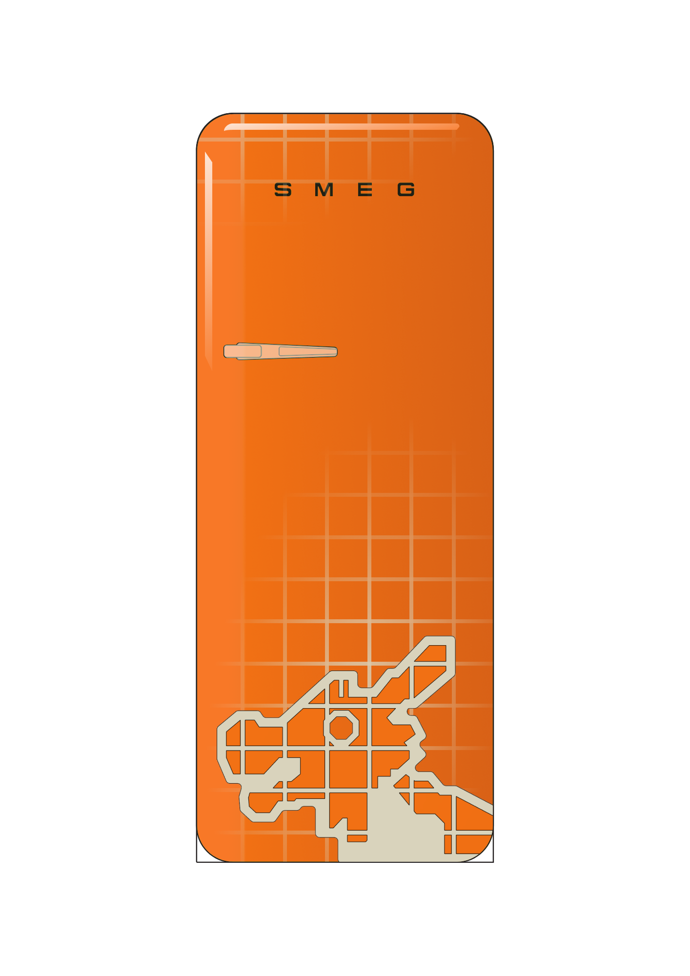
This design celebrates SG60 by capturing our journey from physical childhood spaces to digital innovation. The focal point is the iconic Toa Payoh Dragon Playground, a nostalgic symbol familiar to generations of Singaporeans from our childhood. Its bold orange colour pays tribute to the original playground tiles, bringing warmth and familiarity to the design. The background features a clean digital-style grid with a soft fading gradient effect, inspired by both the structured layout of HDB flats and today’s interconnected world, aligning with SMEG’s signature clean and minimalist design language — keeping the overall aesthetic sleek, modern, and elegant.
The transition and contrast between the dragon and precise geometry of the grid tells a story of how we have evolved from our tactile childhood memories to a future shaped by digital technology, design and innovation. This design hopefully conveys the story and celebration of how far we have come together as a nation.
Home food
Food that can be easily found in many fridge. Can be take over or even left over. Regarless 60 year ago or now, comfort food can never be replace.
Ais Kacang
Chill Layers
The design takes inspiration from Ais Kacang - a beloved dessert that captures the essence of Singapore: colorful, refreshing, and uniquely layered.
Using just 3 key syrup colors - red, green and yellow, the fridge becomes a playful yet elegant tribute to 60 years of flavorful harmony.
These colors are blended in soft, fluid textures across the fridge, mimicking the moment Ais Kacang begins to melt. A fleeting but beautiful symbol of memory and togetherness.
- Abstract expression of syrup over ice.
- The design is sophisticated and open to interpretation.
- Retro SMEG form + local childhood flavors = timeless tribute
Singapore at 60 is just like a bowl of Ais Kacang - complex, cool, and full of surprises. Each color tells a part of nation's journey, and when swirled together, they reflect a united, vibrant identity.
Lapis Sagu
Layered Like Us
My design is inspired by Kueh Lapis Sagu - the traditional pink and green layered dessert loved by many.
Just like the Kueh, Singapore is made up of many layers - different cultures, stories, and memories, all coming together as one. The layers represent how each generation adds something new, while still holding on to what came before.
The pink and green colors bring a sense of warmth and nostalgia. They remind us of snacks, festive seasons, and the little joys that make us feel at home.
This design celebrates how Singapore is both colorful and united. At 60, we honors our past while continuing to grow - one sweet, meaningful layer at a time.
'Roaring Merlion'

Singapore has emerged as a nation with robust economy with an impeccable track record of development in all sectors and become a role model for developing and developed nations across the globe in a short span of sixty years. Its all-inclusive education system, racial harmony, resilience, clean and green image, responsible civic culture are all built, cultivated and strengthened year after year. Singapore is ever evolving in attracting tourists, investors and intellects to its shore continuously. Merlion, a national symbol is now recognized globally as a mark of extraordinary growth story of a tiny city State on the world stage. My effort in this illustration is showcasing the ultra-modern cosmopolitan city amidst lush green parks, colonial terrace houses and otters freely crossing the expressways. Merlion is roaring after emerging from the blue ocean with all its precious gems set in a Peranakan style pattern adorning its belly. Marina bay with all its new attraction is visible at the distant horizon and the Singapore airline's SQ flight rising high in the sky making all Singaporeans head held high just like the Merlion! Sixty and counting Singapore!!
Singapore, Flourish with Love
This design features Singapore's national flower, the orchid, intricately woven into the shape of hearts to symbolise our growth as a nation. Conceptualised digitally and then rendered by hand, the artwork embodies a forward-looking vision while retaining a personal touch. The theme "Flourish" represents our aspiration for Singapore to thrive holistically. This includes not only economic prosperity but also the well-being and personal growth of its people, creating a society that is successful, joyful, and a fulfilling place to live. The sentiment "With Love" signifies a Singapore where progress is tempered with kindness, and where a spirit of mutual care and respect binds the community together. Ultimately, "Singapore, Flourish with Love" encapsulates the aspiration for a future that is prosperous, deeply compassionate, and united.
Play Lah!

Play Lah! transforms the humble fridge into a canvas of connection — a magnet-based board game that brings generations together through laughter, stories, and shared nostalgia. Set against the heartland charm of a Singapore HDB estate, this reimagined Snakes and Ladders swaps snakes for MRTs and ladders for classic laundry pole falls — local quirks we all recognise and love.
Each player picks a mini magnet to represent themselves. While not part of the design template, I suggest using orchid magnets — our national flower — in different colours to add symbolic value and visual charm. Using a dice or optional spinner, players journey across the board toward SG60 — a nod to SG60, marking 60 years of growth, resilience, and unity.
Beyond fun and games, Play Lah! sparks heartfelt conversations across generations. The young learn about Singapore’s unique traits through play, while the old relive warm memories — turning each move into a shared moment of heritage and joy. More than a game, it’s a celebration of family, memory, and the everyday magic that makes us uniquely Singaporean.
The Mascot Of Singapore
The Merlion surrounding the iconic park named Garden by the Bay .
SG60: A Nation in Bloom
In joyous celebration of SG60, this bespoke SMEG fridge design proudly honours Singapore’s vibrant heritage and enduring elegance. Drawing inspiration from the timeless batik motifs, the intricate floral patterns bloom across a regal navy canvas — symbolising the nation’s beauty, diversity, and unity. Every detail reflects the spirit of celebration, from the graceful flow of blossoms to the striking presence of the Merlion, illustrated in radiant gold. As a beloved national symbol, the Merlion anchors the design with strength, resilience, and pride. This artful fusion of tradition and innovation mirrors Singapore’s journey over six decades — bold, spirited, and uniquely ours. A stunning tribute to 60 years of progress, culture, and identity — reimagined through SMEG’s signature style.
Chill Lah, It’s SG60!
This illustration reimagines an open fridge as a playful time capsule of Singapore’s 60-year journey. Instead of food, its shelves hold iconic moments – from kampong days & hawker culture to today’s vibrant skyline, each representing a slice of our shared story.
Familiar animals like a playful otter, a chicken family, & a lounging community cat add local charm & warmth, reflecting how nature quietly lives alongside urban spaces.
To me, Singapore is home – where everyday scenes, big dreams & small joys come together. This artwork turns a humble household fridge into a vessel of memories, inviting us to open up, reflect & celebrate what makes this little red dot so cool, so full of heart & uniquely ours.
MERLION
Design Concept: “Merlion Mosaic” for SMEG Refrigerator
Celebrate Singapore’s spirit with a vibrant tessellation of Merlions—each uniquely colored to reflect the nation’s multicultural harmony. Set against a subtle monochrome background of intricate design work, it blends heritage with modernity. Bold yet elegant, this fridge becomes a functional art piece—symbolizing unity in diversity, rooted in tradition but made for contemporary homes
Dwelling
As a Korean-born New Zealander who moved to Singapore in 2006, I expected public housing to be much like what I had seen elsewhere—neglected and poorly maintained. Instead, I was pleasantly surprised to find that Singapore’s HDB flats far surpassed my expectations.
In honour of Singapore’s 60th birthday, this work reflects my appreciation for the country’s distinct identity. I draw a connection between the vibrant colours of the buildings and the rich mix of races and cultures that live and thrive here. The bold and varied colour combinations across the estates serve as a visual metaphor for the beautifully complex and multicultural character of Singaporean society.
Working on this project has deepened my sense of belonging and strengthened my emotional connection to the place I now call home.
Legacy Bloom
This concept incorporates the geometry of the lotus flower, taking visual cues from the likes of Peranakan tilework, and the retro-modern SMEG aesthetic to create a cohesive and meaningful design.
"Legacy Bloom" represents uninterrupted growth, a flourishing lineage, and timeless design. Inspired by the Peranakan belief in prosperous ancestry and the lotus as a symbol of resilience and rebirth, this fridge celebrates generations—past, present, and future—marking continuity beyond the 60th year and into its legacy.
SG60: Pride in Design, Precision in Identity
This specially designed SMEG fridge commemorates Singapore’s 60th year of independence (SG60) through a bold, modern visual narrative that intertwines national pride with everyday design. The iconic SMEG logo is reimagined with its ‘S’ and ‘G’ prominently highlighted, in order to subtly yet powerfully echo the initials of Singapore, placing the nation’s identity at the heart of the brand.
The fridge’s surface is symmetrically divided, a nod to Singapore’s renowned orderliness and meticulous urban planning. One half features a clean, immaculate rendition of the Singapore flag, treated with care to preserve its dignity and symbolic precision. The crisp red and white, the crescent moon and five stars, which form our national flag; each element stands as a tribute to the values of unity, progress, and resilience.
This design transforms a utilitarian object into a statement piece of national celebration. It embodies the pride I personally hold for Singapore as a homegrown artist in this a small nation with a big heart, where precision meets passion, and design mirrors identity.
Orchid Dream
Simple orchid inspired colours SG
Flavours of Home
This design celebrates 60 years of Singapore through vibrant Peranakan-style tiles. Each tile features local food icons such as chilli crab, satay, thosai, and kueh lapis; reflecting our shared love for Chinese, Malay, and Indian flavours. In the background, iconic landmarks like the Merlion, Marina Bay Sands, the Singapore Flyer, and the Esplanade shine brightly under a sky filled with fireworks. Together, they portray a nation rich in heritage, unity, and pride. Singapore is truly a home filled with flavours and culture.
Mitoboru in Singapore
I’m an artist behind Mitoboru.club and I have incorporated my original character, Mitoboru into the design. He’s mimicking the iconic Merlion in Singapore, with the background of a garden city, represented by the trees and flowers.
a toast to the past
This fridge design is a heartfelt tribute to my favourite Singaporean breakfast and the memories that come with it. Growing up, kaya toast with soft-boiled eggs was my weekend morning ritual — a simple yet comforting joy I always looked forward to.
Adorned with the iconic Peranakan and kopitiam-style floor tiles as the background, I hope to evoke the charming traditional Singaporean coffee shops and rich cultural taperstry of Pernankan shophouses.
I’ve also playfully added the Chinese jotterbook-style characters “冰箱” (refrigerator), reminiscent of my old-school Singaporean stationery.
As a cheeky nod to our multilingual society, I reinterpreted "DANGER" sign in all four national languages.
I hope this design brings the warmth, vibrancy and cherished memories of local culture.
Vanda
Inspired by the elegance of Vanda Miss Joaquim, this design blossoms with radiant energy and national pride. Framed within the iconic Smeg silhouette, vibrant hues of magenta, lime, turquoise, and tangerine dance in batik-like rhythm, evoking Singapore’s rich tapestry of cultures. Each orchid is outlined with bold, flowing lines, reminiscent of traditional wax-resist batik techniques, yet reimagined in a modern, pop-art palette. The background pulses with movement—like stained glass or sunlit tropical leaves—symbolising growth, diversity, and unity. As Singapore turns 60, this piece celebrates not only the strength and resilience embodied by our national flower, but also the colourful vibrance of our everyday lives. Rooted in heritage and blooming with contemporary flair, it’s a tribute to the Singapore spirit: always evolving, always in full colour.
Many faces of Singapore

Inspired by SG60: Building Our Singapore Together and SG60: Celebrating 60 Years of Singapore, with the message from the SG60 Campaign as Singaporeans finds many creatives way to give back. My design is showcasing iconic "faces" that would instantly be recognize as Singapore with a background of Singaporeans favourite local snacks- Bahulu and Gem biscuits. These faces brings their own message:
•Merlion- Singapore's history and identity 60 years on now
• Singapore Heritage Dragon Playground- once a very common sight for a childhood well spend now a beloved landmark for Singaporeans to reminisce on as they outgrew it
•Sharity- an iconic community mascot that inculcate empathy in us since we are kids to always care and share with each other
•Singa the Lion- another local iconic mascot that educates us on courtesy and kindness
All these faces come together in my design to align with this year SG60 campaign which is to strive to be bolder and kinder to one another and play our part in building a stronger Singapore. MAJULAH SINGAPURA!
Singapore CBD
This is my favourite part of Singapore.
Durian Journeys: 60 Years to Singapore
My are style usually consists of cute, simple characters, which relates to the topic. Since Singapore’s unique fruit is a durian, I drew a durian “hanging off” of the fridge handle, with a background of Singapore’s most significant landmarks and views, including Marina Bay Sands, the Singapore Ferris Wheel, the Singapore F1 track, the beautiful fireworks, and so on. I thought that this design would show the beauty of Singapore in a cute, fun way. I wish to show many people my fun art style (the durian character :)) while also being able to show many how the country of Singapore means so much to me.
Smegapore
This is a playful and graphic interpretation of some of my favourite Singapore's iconic symbols, featuring Changi Airport, Marina Bay Sands, chilli crab etc. It embodies the essence of Singapore's rich culture, heritage and modernity. The bold background amplifies the lively colours, evoking a sense of energy and national pride while the dynamic typography reflects the bustling spirit of the city. I hope my design evokes a powerful sense of Singapore's identity, making this fridge a distinctive tribute to SG60.
Sea Hub
Singapore is a small island surrounded by the sea. The Merlion is an iconic symbol that represents Singapore. The water flowing from the Merlion’s mouth symbolizes continuous progress and contribution to shipping and trade, which have helped bring Singapore to greater heights. The MBS symbolize the maritime trade.
The Mythical Guardian
I draw Merlion as Singapore Famous Mascot and tourist attraction with colourful background .
SG60: Together We Shine
As a proud SG50 baby, I designed this SG60-themed artwork to celebrate 60 years of Singapore’s independence. My inspiration comes from our iconic landmarks and the spirit of progress. I included the Merlion to symbolise national pride, the Supertree Grove and Marina Bay Sands to reflect innovation and sustainability, and the Singapore Flyer for our bold vision of the future. The Singapore Airlines plane represents our global connections, while fireworks express the joy of our nation’s achievements. I chose a vibrant red background with white line art to represent unity, resilience, and celebration—qualities that define Singapore. Through this design, I hope to capture the essence of who we are and how far we’ve come as one united people.
Flowing Nation
I wanted to combine art, motion, and memory in celebration of SG60. The swirl of red and white represents the continuous flow of memories and progress, while also resembling an ‘S’ for Singapore. Faint, colourful shadow-like silhouettes of iconic landmarks such as the Singapore Flyer, Marina Bay Sands, and the Changi Control Tower are subtly layered into the background, reflecting how these places have quietly become part of our everyday lives and shape our skyline. The brushstroke texture adds energy and vitality, representing my voice as a youth ready to step up and contribute to Singapore’s future. Finally, the curved forms of SG60 and Marina Bay Sands flow harmoniously with the design’s colours, symbolising unity and our shared journey forward as one nation.